Designing Website Experiences That Win in the AI Era
AI hasn’t killed websites. It has changed how we build them. Every business still needs a website that supports their brand, conversion funnel, and credibility. Discover how to create a high-performance website that serves your brand, business strategy and sales goals with our six proven strategies.
1. Create a Structure That Serves Impatience
Structuring a website is about how well you respond to the user’s intent. We apply the “3-click rule” across our website projects: user must be able to take any critical action in three clicks or fewer. This principle improves flow and reduces bounce rates, on the top of preventing user frustration. It's a simple, classic rule, but it's easier said than done.
We also focus on "one message & one action" per scroll/section. Users should know exactly what message is conveyed and what action to take in each section. For example, in a section stating that "our chocolate is made in Switzerland using artisanal methods", the user discovers about the product making, nothing more — no shipping policy or sustainability endeavours. Here user forms opinion about the product, not the company or its people.
Providing users with simpler, more concise information helps them to stay engaged, feel in control, and feel empowered to continue. A common misconception is that offering all information and options at once is helpful, but it is not. It only leads to decision fatigue. Most users just want to complete their task quickly and easily. In fact, users engage, click and respond better when they are offered more targeted and minimal options. Think about your decision-making effort between 50 pizza options and a set meal.
Users decide within seconds whether to stay on your website. They don't do this by reading, but by scanning. That's why we design homepages to act as a control centre: clear navigation, key actions (book, download, buy) visible without scrolling, and content organised in sections that are intuitive and direct.
By creating a structure that removes unnecessary choices and surfaces the right content at the right moment, you empower users, and that translates into a better customer experience.
2. Lead with Visuals, Not Paragraphs
High-resolution imagery, short videos, infographics, and iconography are essential in our visual-first era. But here’s the challenge: attention spans are short, and decision-makers expect immediate clarity. Long blocks of text are rarely read, at least not until visitors are convinced your website is worth their time.
That's why we follow a simple principle: online, visuals capture attention first. That means balancing text with meaningful imagery and videos, building a clear content hierarchy that gets to the point fast, and creating breathing room through intentional spacing to make content faster to absorb.
In our previous projects in education and hospitality, we replaced corporate jargon with visual storytelling: campus life in motion, team portraits, service walkthroughs. A single strong image often conveys more credibility than a paragraph ever could. This doesn’t mean turning your website into a photo moodboard. It means designing for fast decision-making. Visitors want immediate answers: who are you, what do you do, if they can trust you. Your website must deliver these signals upfront, striking the right balance between text and visuals.
3. Apply Brand Thinking to UX
Your website should manifest your brand experience in every interaction — far beyond just the logo or colour palette. The real challenge is whether you can turn brand design into a competitive advantage for your website.
Put simply: if a user has 48 websites open on their mobile phone, would they still recognise yours? This isn’t a memory game; it’s a measure of whether your digital presence is distinctive enough to remain top-of-mind.
A great online brand experience is the result of deliberate, detail-driven design decisions: how forms respond, how icons appear, how navigation flows, and even how error messages speak to the user. At Creative Supply, we obsess over these details, because when the design “feels” like your brand, down to the smallest element, it creates an experience that is both memorable and difficult for competitors to replicate.
Here are a few examples of where we applied brand thinking to website design:
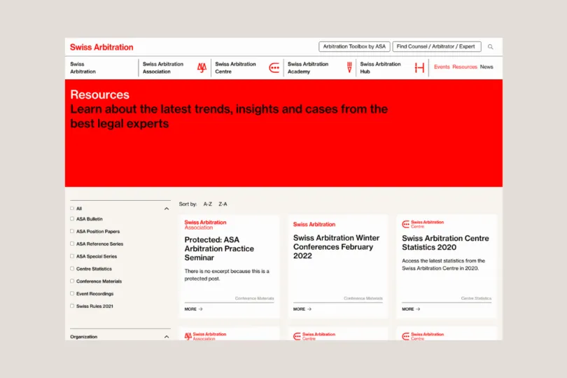
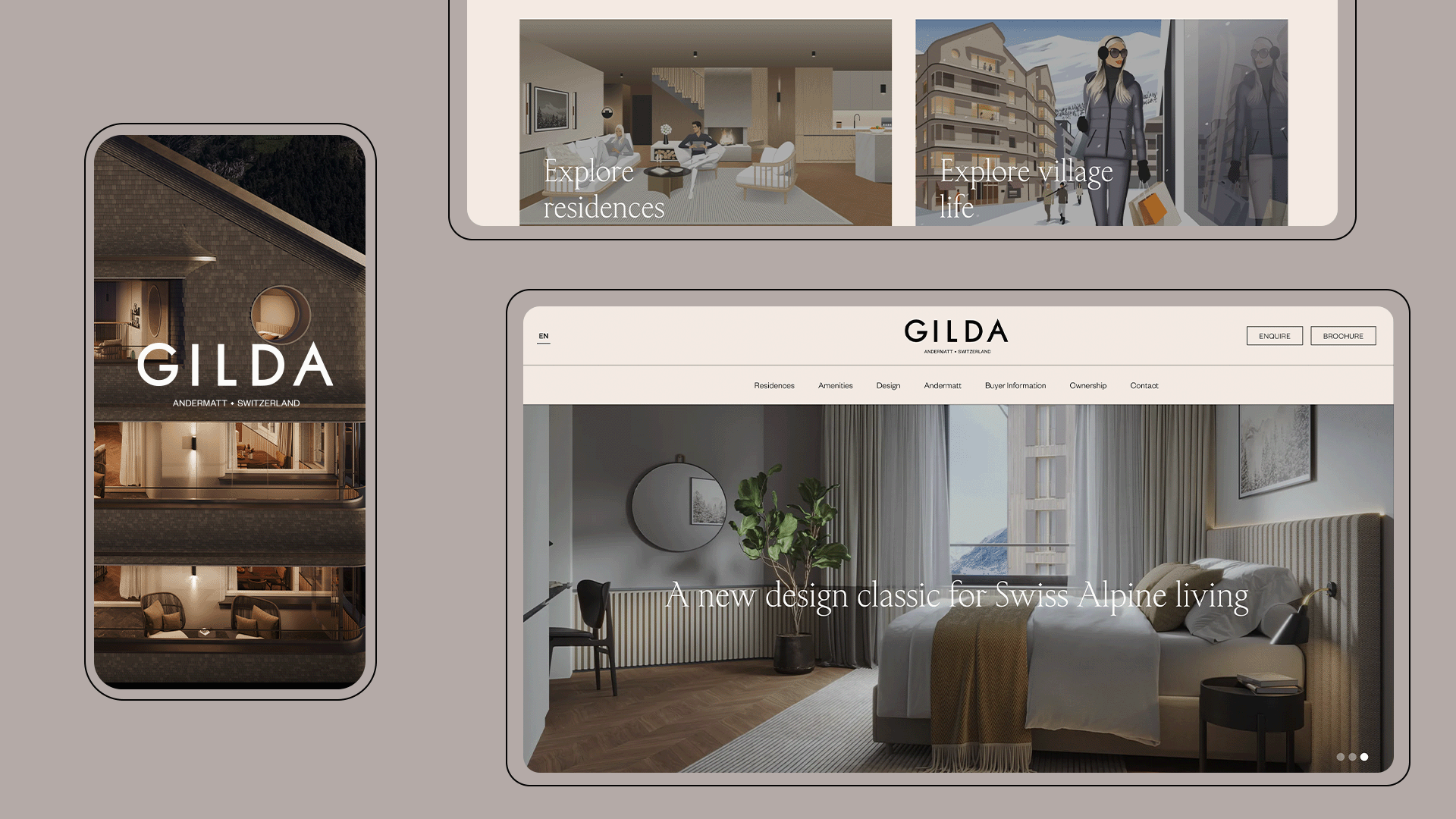
- Structuring content to match brand promise and reinforcing brand perceptions through layout and hierarchy — for example, the clean, direct, “Swiss-like” structure we designed for Swiss Arbitration
- Creating a distinctive visual system of colours, typography, and iconography, ensuring every page is instantly recognisable — as seen in the playful yet institutional look of Bluemorrow
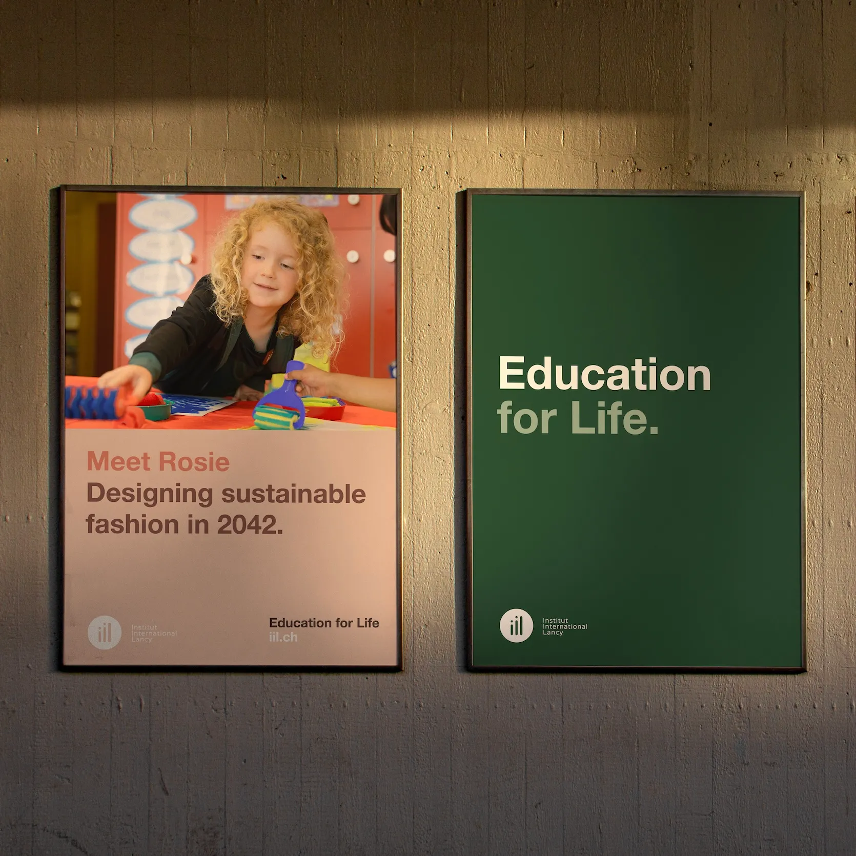
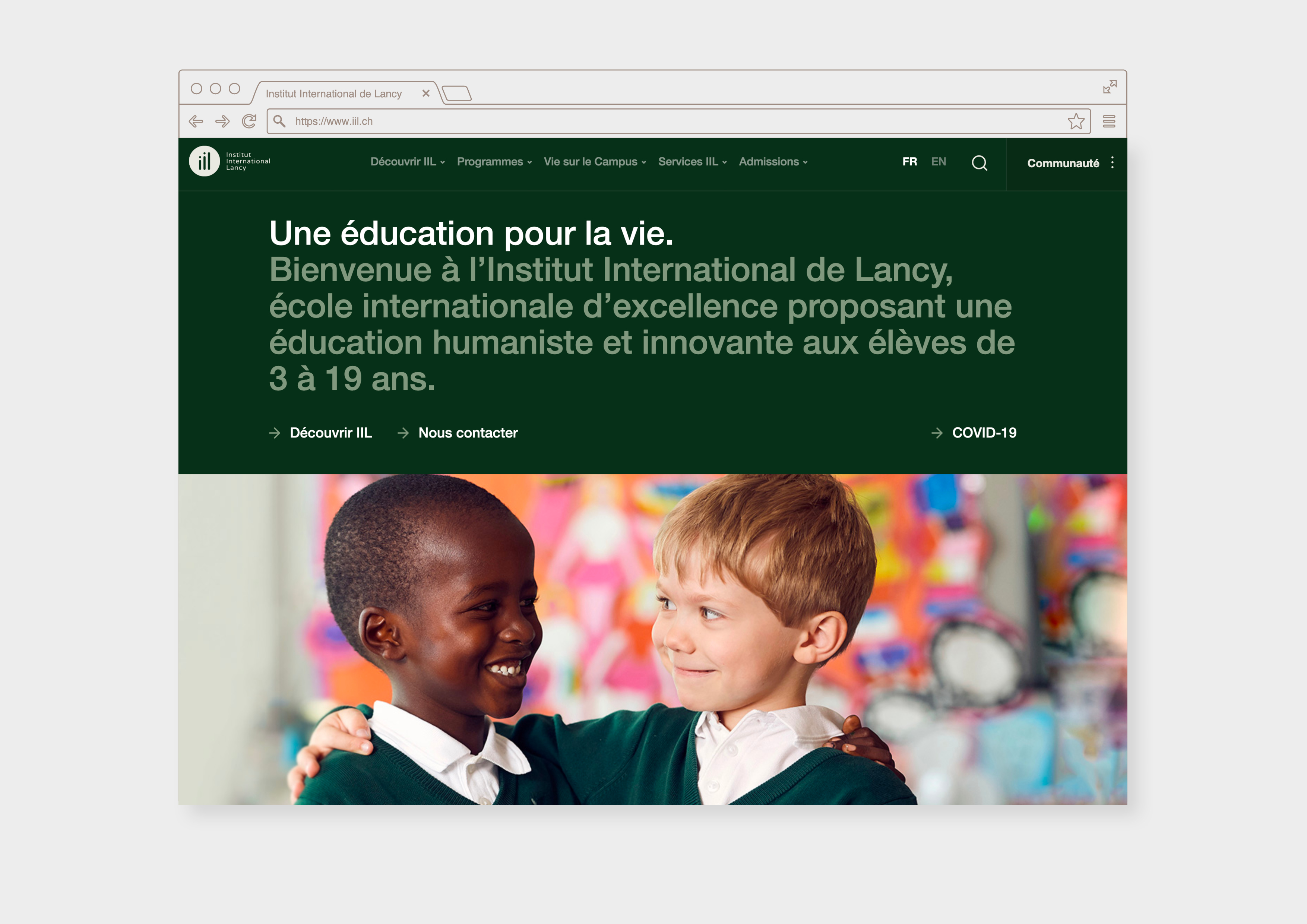
- Maintaining brand voice consistently, from headlines and button labels to error messages, reinforcing brand personality at every interaction — as with the future-oriented, humanistic tone of voice for Institut International de Lancy
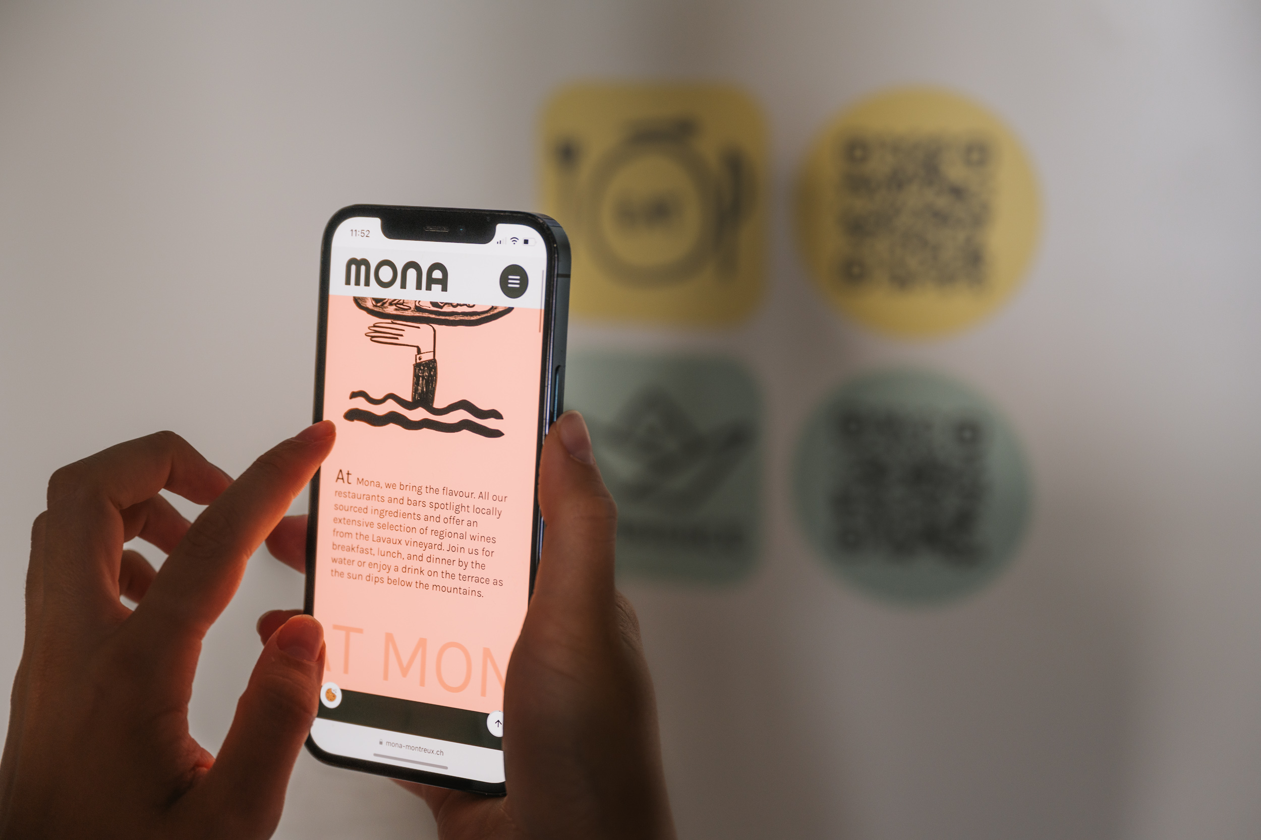
- Designing memorable micro-interactions, from subtle button animations to unexpected features — such as the "Make Your Jazz Anthem" experience we developed for Mona.
When brand thinking shapes UX, your website stops being a generic digital space and becomes a true extension of your brand identity. In an AI-driven world where visual sameness is just a prompt away, distinct brand-driven UX is one of the few long-lasting competitive advantages you can own.
4. Build for Mobile-First, AI-Second
Most people will experience your website on a mobile screen; sometimes while standing in a queue, hailing a taxi, or browsing between meetings. In those moments, attention spans are short, patience is even shorter. Every layout choice, tap interaction, and loading time has to work for a distracted, one-handed user on the go.
The next frontier is AI-readiness. Your website isn’t just visited by people anymore. It’s scanned, indexed, and interpreted by search engines and AI assistants. The question is: can both audiences find what they need?
At Creative Supply, we build websites to be readable by both people and machines: optimised metadata, simple content hierarchy, and clear language to ensure discoverability on search engines and AI platforms. We treat website structure like a well-organised shop. If customers can’t find what they’re looking for in seconds, neither can algorithms. AI can only amplify what’s already clear and well-structured.
On a side note, we love decluttering complex apps and simplifying lengthy websites. It's kind of like "Swedish death cleaning" for us!
5. Remove Friction, Respect User Flow
Conversion isn’t about flashing CTAs. It’s about reducing friction. That means fewer form fields, faster loading times, simplified language, and intuitive user journeys.
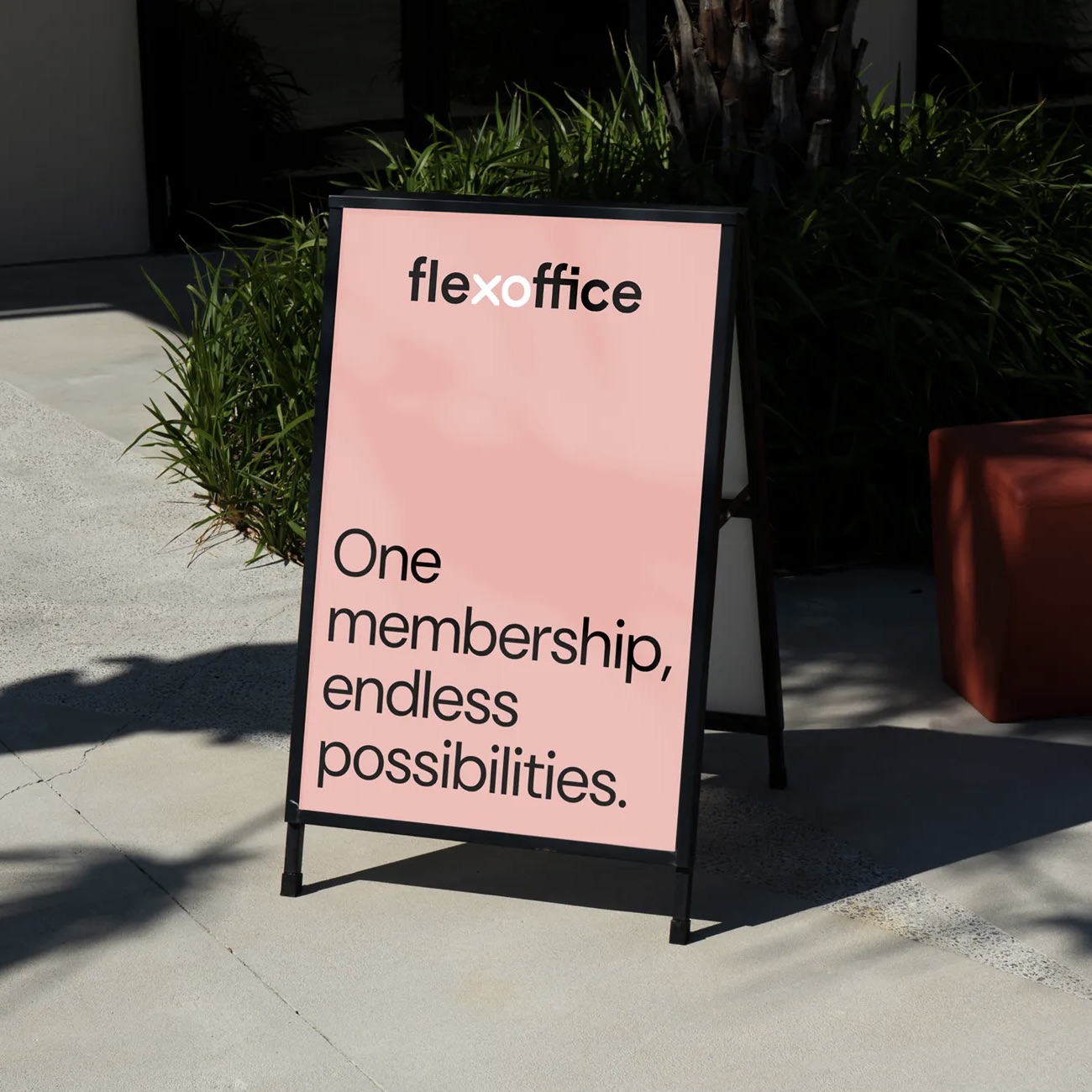
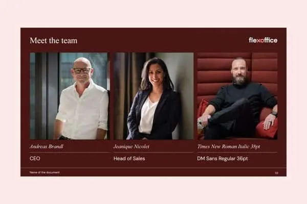
In our successful digital design work with FlexOffice, we redesigned the online onboarding funnel together with the sales team to address questions that competitors often avoid answering online. We shared and compared pricing transparently, answered the most pressing sales enquiries upfront, and invited prospects to book an office tour instead of pushing for an immediate signature.
The result? More informed leads, faster conversions, and fewer repetitive customer queries.
Too often, businesses forget they are also customers themselves, and none of us enjoy feeling “sold to”. We all prefer a smooth, effortless experience that respects our decision-making process. By focusing on the office tour, we reassured customers, gave them space to compare options, and aligned with them once their hesitations were gone.
In a world of information overload and sales pressure, every extra click, field, or delay is an opportunity for users to drop off. Map out your user journey as if you were the customer and remove all website elements (without mercy) you would not want other websites give to you. Removing friction is about turning hesitant visitors into confident customers by letting them smoothly navigate the experience of your website.
6. Design for Humans, Not Hype
Trends evolve, user habits shift, and technology advances. Yet the fundamentals remain unchanged. People still want the same core things: a good product and a good experience. Before chasing the latest digital innovation, it is worth pausing and returning to the essentials.
Ask yourself: If I visit my own website as a customer, can I immediately find the information I need? Is the journey effortless and satisfying?
An AI-powered chatbot won’t make a business “AI-ready” if the basics of digital usability are ignored. Too often, organisations overlook simple yet crucial elements on their websites, such as clearly displayed opening hours, information about on-site parking, and easy-to-find e-commerce return costs for your country. Investing in complex tools often adds little value to the customer journey or to meeting real customer needs. In reality, fixing fundamentals delivers faster returns, higher customer satisfaction, and more repeat business than any trend-driven upgrade.
In other words, if your business cannot master the basics of digital usability, it will struggle to benefit fully from more advanced tools such as AI.
Final Thoughts
The future of website design isn’t about chasing every new capability. It’s about mastering the timeless principles of clarity, accessibility, and delight, and then enhancing these with the right technologies. Businesses that get the basics right will always be better positioned to integrate emerging tools successfully. Getting your website's user experience (UX) and conversion flows right, and leveraging storytelling and design differentiation, is what positions you for success in the face of the AI wave.
Looking to Strengthen Your Website?
Whether you're repositioning your brand, launching a business, or rethinking your digital presence, a well-designed website that aligns with your business goals and brand strategy is the most important communication channel for visibility, trust and conversion.
At Creative Supply, we help companies across industries build digital platforms that combine branding, user experience, and storytelling. From UX strategy and visual interface design to content creation and technical roll-out, we can help you create a website that truly works for your business.
👉 Contact us to find out how we can help you develop an impactful website for your business.
Designing Website Experiences That Win in the AI Era
1. Create a Structure That Serves Impatience
Structuring a website is about how well you respond to the user’s intent. We apply the “3-click rule” across our website projects: user must be able to take any critical action in three clicks or fewer. This principle improves flow and reduces bounce rates, on the top of preventing user frustration. It's a simple, classic rule, but it's easier said than done.
We also focus on "one message & one action" per scroll/section. Users should know exactly what message is conveyed and what action to take in each section. For example, in a section stating that "our chocolate is made in Switzerland using artisanal methods", the user discovers about the product making, nothing more — no shipping policy or sustainability endeavours. Here user forms opinion about the product, not the company or its people.
Providing users with simpler, more concise information helps them to stay engaged, feel in control, and feel empowered to continue. A common misconception is that offering all information and options at once is helpful, but it is not. It only leads to decision fatigue. Most users just want to complete their task quickly and easily. In fact, users engage, click and respond better when they are offered more targeted and minimal options. Think about your decision-making effort between 50 pizza options and a set meal.
Users decide within seconds whether to stay on your website. They don't do this by reading, but by scanning. That's why we design homepages to act as a control centre: clear navigation, key actions (book, download, buy) visible without scrolling, and content organised in sections that are intuitive and direct.
By creating a structure that removes unnecessary choices and surfaces the right content at the right moment, you empower users, and that translates into a better customer experience.
2. Lead with Visuals, Not Paragraphs
High-resolution imagery, short videos, infographics, and iconography are essential in our visual-first era. But here’s the challenge: attention spans are short, and decision-makers expect immediate clarity. Long blocks of text are rarely read, at least not until visitors are convinced your website is worth their time.
That's why we follow a simple principle: online, visuals capture attention first. That means balancing text with meaningful imagery and videos, building a clear content hierarchy that gets to the point fast, and creating breathing room through intentional spacing to make content faster to absorb.
In our previous projects in education and hospitality, we replaced corporate jargon with visual storytelling: campus life in motion, team portraits, service walkthroughs. A single strong image often conveys more credibility than a paragraph ever could. This doesn’t mean turning your website into a photo moodboard. It means designing for fast decision-making. Visitors want immediate answers: who are you, what do you do, if they can trust you. Your website must deliver these signals upfront, striking the right balance between text and visuals.
3. Apply Brand Thinking to UX
Your website should manifest your brand experience in every interaction — far beyond just the logo or colour palette. The real challenge is whether you can turn brand design into a competitive advantage for your website.
Put simply: if a user has 48 websites open on their mobile phone, would they still recognise yours? This isn’t a memory game; it’s a measure of whether your digital presence is distinctive enough to remain top-of-mind.
A great online brand experience is the result of deliberate, detail-driven design decisions: how forms respond, how icons appear, how navigation flows, and even how error messages speak to the user. At Creative Supply, we obsess over these details, because when the design “feels” like your brand, down to the smallest element, it creates an experience that is both memorable and difficult for competitors to replicate.
Here are a few examples of where we applied brand thinking to website design:
- Structuring content to match brand promise and reinforcing brand perceptions through layout and hierarchy — for example, the clean, direct, “Swiss-like” structure we designed for Swiss Arbitration
- Creating a distinctive visual system of colours, typography, and iconography, ensuring every page is instantly recognisable — as seen in the playful yet institutional look of Bluemorrow
- Maintaining brand voice consistently, from headlines and button labels to error messages, reinforcing brand personality at every interaction — as with the future-oriented, humanistic tone of voice for Institut International de Lancy
- Designing memorable micro-interactions, from subtle button animations to unexpected features — such as the "Make Your Jazz Anthem" experience we developed for Mona.
When brand thinking shapes UX, your website stops being a generic digital space and becomes a true extension of your brand identity. In an AI-driven world where visual sameness is just a prompt away, distinct brand-driven UX is one of the few long-lasting competitive advantages you can own.
4. Build for Mobile-First, AI-Second
Most people will experience your website on a mobile screen; sometimes while standing in a queue, hailing a taxi, or browsing between meetings. In those moments, attention spans are short, patience is even shorter. Every layout choice, tap interaction, and loading time has to work for a distracted, one-handed user on the go.
The next frontier is AI-readiness. Your website isn’t just visited by people anymore. It’s scanned, indexed, and interpreted by search engines and AI assistants. The question is: can both audiences find what they need?
At Creative Supply, we build websites to be readable by both people and machines: optimised metadata, simple content hierarchy, and clear language to ensure discoverability on search engines and AI platforms. We treat website structure like a well-organised shop. If customers can’t find what they’re looking for in seconds, neither can algorithms. AI can only amplify what’s already clear and well-structured.
On a side note, we love decluttering complex apps and simplifying lengthy websites. It's kind of like "Swedish death cleaning" for us!
5. Remove Friction, Respect User Flow
Conversion isn’t about flashing CTAs. It’s about reducing friction. That means fewer form fields, faster loading times, simplified language, and intuitive user journeys.
In our successful digital design work with FlexOffice, we redesigned the online onboarding funnel together with the sales team to address questions that competitors often avoid answering online. We shared and compared pricing transparently, answered the most pressing sales enquiries upfront, and invited prospects to book an office tour instead of pushing for an immediate signature.
The result? More informed leads, faster conversions, and fewer repetitive customer queries.
Too often, businesses forget they are also customers themselves, and none of us enjoy feeling “sold to”. We all prefer a smooth, effortless experience that respects our decision-making process. By focusing on the office tour, we reassured customers, gave them space to compare options, and aligned with them once their hesitations were gone.
In a world of information overload and sales pressure, every extra click, field, or delay is an opportunity for users to drop off. Map out your user journey as if you were the customer and remove all website elements (without mercy) you would not want other websites give to you. Removing friction is about turning hesitant visitors into confident customers by letting them smoothly navigate the experience of your website.
6. Design for Humans, Not Hype
Trends evolve, user habits shift, and technology advances. Yet the fundamentals remain unchanged. People still want the same core things: a good product and a good experience. Before chasing the latest digital innovation, it is worth pausing and returning to the essentials.
Ask yourself: If I visit my own website as a customer, can I immediately find the information I need? Is the journey effortless and satisfying?
An AI-powered chatbot won’t make a business “AI-ready” if the basics of digital usability are ignored. Too often, organisations overlook simple yet crucial elements on their websites, such as clearly displayed opening hours, information about on-site parking, and easy-to-find e-commerce return costs for your country. Investing in complex tools often adds little value to the customer journey or to meeting real customer needs. In reality, fixing fundamentals delivers faster returns, higher customer satisfaction, and more repeat business than any trend-driven upgrade.
In other words, if your business cannot master the basics of digital usability, it will struggle to benefit fully from more advanced tools such as AI.
Final Thoughts
The future of website design isn’t about chasing every new capability. It’s about mastering the timeless principles of clarity, accessibility, and delight, and then enhancing these with the right technologies. Businesses that get the basics right will always be better positioned to integrate emerging tools successfully. Getting your website's user experience (UX) and conversion flows right, and leveraging storytelling and design differentiation, is what positions you for success in the face of the AI wave.
Looking to Strengthen Your Website?
Whether you're repositioning your brand, launching a business, or rethinking your digital presence, a well-designed website that aligns with your business goals and brand strategy is the most important communication channel for visibility, trust and conversion.
At Creative Supply, we help companies across industries build digital platforms that combine branding, user experience, and storytelling. From UX strategy and visual interface design to content creation and technical roll-out, we can help you create a website that truly works for your business.
👉 Contact us to find out how we can help you develop an impactful website for your business.

Designing Website Experiences That Win in the AI Era
AI hasn’t killed websites. It has changed how we build them. Every business still needs a website that supports their brand, conversion funnel, and credibility. Discover how to create a high-performance website that serves your brand, business strategy and sales goals with our six proven strategies.
1. Create a Structure That Serves Impatience
Structuring a website is about how well you respond to the user’s intent. We apply the “3-click rule” across our website projects: user must be able to take any critical action in three clicks or fewer. This principle improves flow and reduces bounce rates, on the top of preventing user frustration. It's a simple, classic rule, but it's easier said than done.
We also focus on "one message & one action" per scroll/section. Users should know exactly what message is conveyed and what action to take in each section. For example, in a section stating that "our chocolate is made in Switzerland using artisanal methods", the user discovers about the product making, nothing more — no shipping policy or sustainability endeavours. Here user forms opinion about the product, not the company or its people.
Providing users with simpler, more concise information helps them to stay engaged, feel in control, and feel empowered to continue. A common misconception is that offering all information and options at once is helpful, but it is not. It only leads to decision fatigue. Most users just want to complete their task quickly and easily. In fact, users engage, click and respond better when they are offered more targeted and minimal options. Think about your decision-making effort between 50 pizza options and a set meal.
Users decide within seconds whether to stay on your website. They don't do this by reading, but by scanning. That's why we design homepages to act as a control centre: clear navigation, key actions (book, download, buy) visible without scrolling, and content organised in sections that are intuitive and direct.
By creating a structure that removes unnecessary choices and surfaces the right content at the right moment, you empower users, and that translates into a better customer experience.
2. Lead with Visuals, Not Paragraphs
High-resolution imagery, short videos, infographics, and iconography are essential in our visual-first era. But here’s the challenge: attention spans are short, and decision-makers expect immediate clarity. Long blocks of text are rarely read, at least not until visitors are convinced your website is worth their time.
That's why we follow a simple principle: online, visuals capture attention first. That means balancing text with meaningful imagery and videos, building a clear content hierarchy that gets to the point fast, and creating breathing room through intentional spacing to make content faster to absorb.
In our previous projects in education and hospitality, we replaced corporate jargon with visual storytelling: campus life in motion, team portraits, service walkthroughs. A single strong image often conveys more credibility than a paragraph ever could. This doesn’t mean turning your website into a photo moodboard. It means designing for fast decision-making. Visitors want immediate answers: who are you, what do you do, if they can trust you. Your website must deliver these signals upfront, striking the right balance between text and visuals.
3. Apply Brand Thinking to UX
Your website should manifest your brand experience in every interaction — far beyond just the logo or colour palette. The real challenge is whether you can turn brand design into a competitive advantage for your website.
Put simply: if a user has 48 websites open on their mobile phone, would they still recognise yours? This isn’t a memory game; it’s a measure of whether your digital presence is distinctive enough to remain top-of-mind.
A great online brand experience is the result of deliberate, detail-driven design decisions: how forms respond, how icons appear, how navigation flows, and even how error messages speak to the user. At Creative Supply, we obsess over these details, because when the design “feels” like your brand, down to the smallest element, it creates an experience that is both memorable and difficult for competitors to replicate.
Here are a few examples of where we applied brand thinking to website design:
- Structuring content to match brand promise and reinforcing brand perceptions through layout and hierarchy — for example, the clean, direct, “Swiss-like” structure we designed for Swiss Arbitration
- Creating a distinctive visual system of colours, typography, and iconography, ensuring every page is instantly recognisable — as seen in the playful yet institutional look of Bluemorrow
- Maintaining brand voice consistently, from headlines and button labels to error messages, reinforcing brand personality at every interaction — as with the future-oriented, humanistic tone of voice for Institut International de Lancy
- Designing memorable micro-interactions, from subtle button animations to unexpected features — such as the "Make Your Jazz Anthem" experience we developed for Mona.
When brand thinking shapes UX, your website stops being a generic digital space and becomes a true extension of your brand identity. In an AI-driven world where visual sameness is just a prompt away, distinct brand-driven UX is one of the few long-lasting competitive advantages you can own.
4. Build for Mobile-First, AI-Second
Most people will experience your website on a mobile screen; sometimes while standing in a queue, hailing a taxi, or browsing between meetings. In those moments, attention spans are short, patience is even shorter. Every layout choice, tap interaction, and loading time has to work for a distracted, one-handed user on the go.
The next frontier is AI-readiness. Your website isn’t just visited by people anymore. It’s scanned, indexed, and interpreted by search engines and AI assistants. The question is: can both audiences find what they need?
At Creative Supply, we build websites to be readable by both people and machines: optimised metadata, simple content hierarchy, and clear language to ensure discoverability on search engines and AI platforms. We treat website structure like a well-organised shop. If customers can’t find what they’re looking for in seconds, neither can algorithms. AI can only amplify what’s already clear and well-structured.
On a side note, we love decluttering complex apps and simplifying lengthy websites. It's kind of like "Swedish death cleaning" for us!
5. Remove Friction, Respect User Flow
Conversion isn’t about flashing CTAs. It’s about reducing friction. That means fewer form fields, faster loading times, simplified language, and intuitive user journeys.
In our successful digital design work with FlexOffice, we redesigned the online onboarding funnel together with the sales team to address questions that competitors often avoid answering online. We shared and compared pricing transparently, answered the most pressing sales enquiries upfront, and invited prospects to book an office tour instead of pushing for an immediate signature.
The result? More informed leads, faster conversions, and fewer repetitive customer queries.
Too often, businesses forget they are also customers themselves, and none of us enjoy feeling “sold to”. We all prefer a smooth, effortless experience that respects our decision-making process. By focusing on the office tour, we reassured customers, gave them space to compare options, and aligned with them once their hesitations were gone.
In a world of information overload and sales pressure, every extra click, field, or delay is an opportunity for users to drop off. Map out your user journey as if you were the customer and remove all website elements (without mercy) you would not want other websites give to you. Removing friction is about turning hesitant visitors into confident customers by letting them smoothly navigate the experience of your website.
6. Design for Humans, Not Hype
Trends evolve, user habits shift, and technology advances. Yet the fundamentals remain unchanged. People still want the same core things: a good product and a good experience. Before chasing the latest digital innovation, it is worth pausing and returning to the essentials.
Ask yourself: If I visit my own website as a customer, can I immediately find the information I need? Is the journey effortless and satisfying?
An AI-powered chatbot won’t make a business “AI-ready” if the basics of digital usability are ignored. Too often, organisations overlook simple yet crucial elements on their websites, such as clearly displayed opening hours, information about on-site parking, and easy-to-find e-commerce return costs for your country. Investing in complex tools often adds little value to the customer journey or to meeting real customer needs. In reality, fixing fundamentals delivers faster returns, higher customer satisfaction, and more repeat business than any trend-driven upgrade.
In other words, if your business cannot master the basics of digital usability, it will struggle to benefit fully from more advanced tools such as AI.
Final Thoughts
The future of website design isn’t about chasing every new capability. It’s about mastering the timeless principles of clarity, accessibility, and delight, and then enhancing these with the right technologies. Businesses that get the basics right will always be better positioned to integrate emerging tools successfully. Getting your website's user experience (UX) and conversion flows right, and leveraging storytelling and design differentiation, is what positions you for success in the face of the AI wave.
Looking to Strengthen Your Website?
Whether you're repositioning your brand, launching a business, or rethinking your digital presence, a well-designed website that aligns with your business goals and brand strategy is the most important communication channel for visibility, trust and conversion.
At Creative Supply, we help companies across industries build digital platforms that combine branding, user experience, and storytelling. From UX strategy and visual interface design to content creation and technical roll-out, we can help you create a website that truly works for your business.
👉 Contact us to find out how we can help you develop an impactful website for your business.

%20Spend.jpeg)
.gif)