The Subliminal Power of Visual Brand Identity
What connects Jamie Oliver and Lidl? Discover how a carefully crafted visual identity can influence your customers’ subconscious, justify premium pricing, and set your brand apart from the competition.


Everyday Encounters with Brand Cues
Think back to your last supermarket visit. Shopping for low-fat milk? You probably went straight to the light blue packaging. Looking for men’s skincare? The abundance of black and navy signalled you were in the right section. In the pasta aisle, Jamie Oliver’s smiling face on a bag of jasmine rice may have inspired trust and familiarity. And that small green organic label on the vegetable display likely sent mixed signals to your brain: “more expensive, but better quality.”
Almost without realising, your brain decodes these visual signals to navigate a sea of choices. This is the power of visual identity, guiding purchasing decisions through subconscious associations.
Speaking to the Subconscious
Daniel Kahneman, Nobel Prize-winning psychologist and economist, distinguishes between two modes of thought:
- System 1: Fast, instinctive, emotional
- System 2: Slow, deliberate, logical
Research suggests that over 90% of mental activity happens in system 1. In branding terms, this means consumers often judge products in milliseconds, based solely on visual cues.
A brand’s visual identity — its logos, colours, shapes, typography, imagery and layout — creates the framework for these split-second perceptions. It is a strategic tool as much as a design one, shaping the way people recognise, categorise and value your offering.
In Biel, Swiss machine-tool manufacturer Strausak turned to us to help differentiate their brand. While competitors relied on technical or generic stock imagery, we embraced monochrome 3D renderings of machine parts — a minimalist aesthetic inspired by product design. This distinctive approach highlighted the usability and innovation of their machines.

Cognition First, Aesthetics Second
Visual identity is, above all, about cognition. Before exploring design aesthetics, a brand must define its strategic objectives.
Are you positioning your brand as luxury, affordable, or niche? Which associations should customers make when they see your brand? What key messages must your visual system convey?
Clear answers to these questions prevent subjective bias. It’s not about a founder’s personal preference for a colour or typeface, but about whether a particular combination, for example, dark blue with classic serif lettering, reinforces the intended brand positioning. That's why this strategic groundwork is essential for branding projects before moving to brand design.
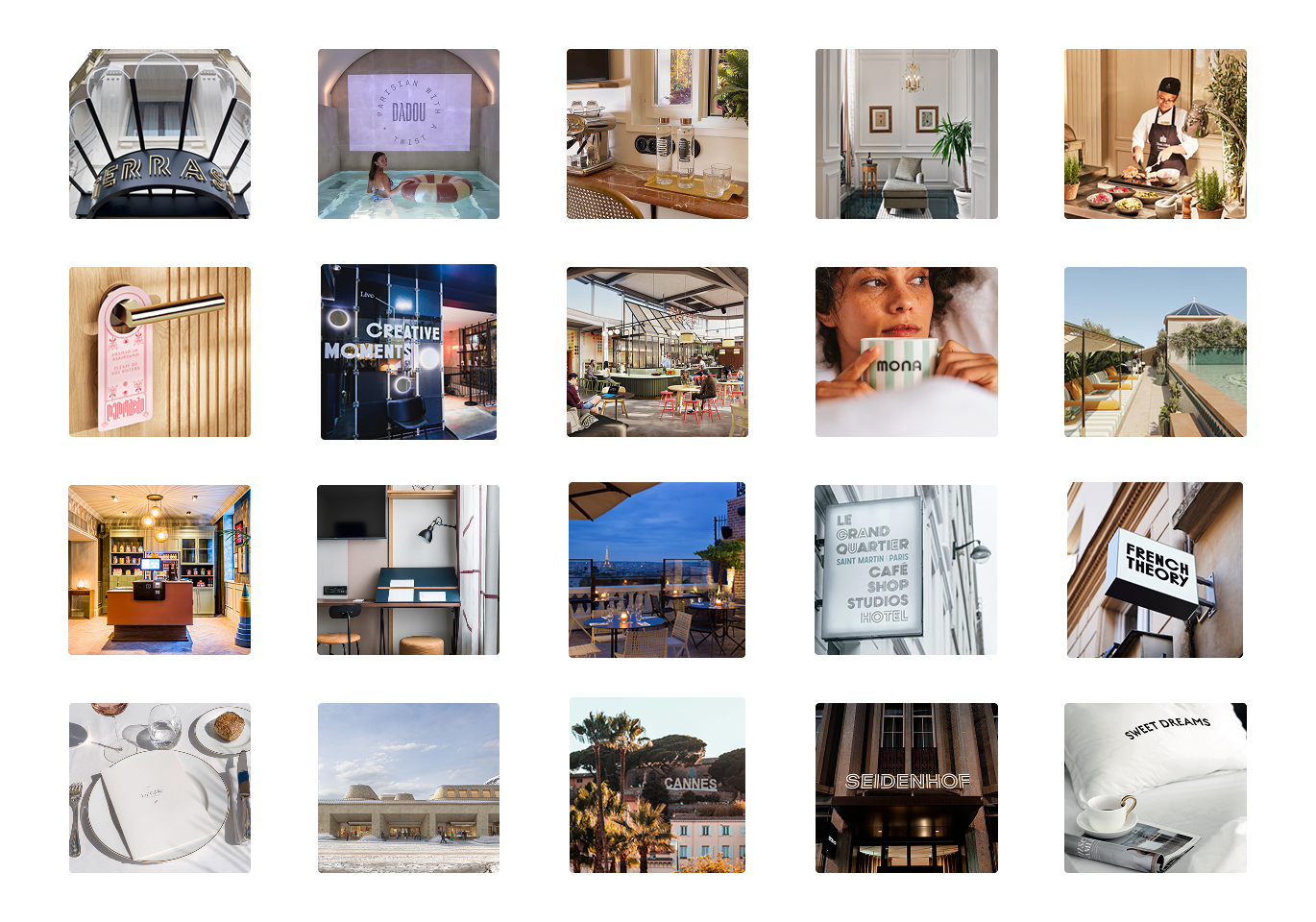
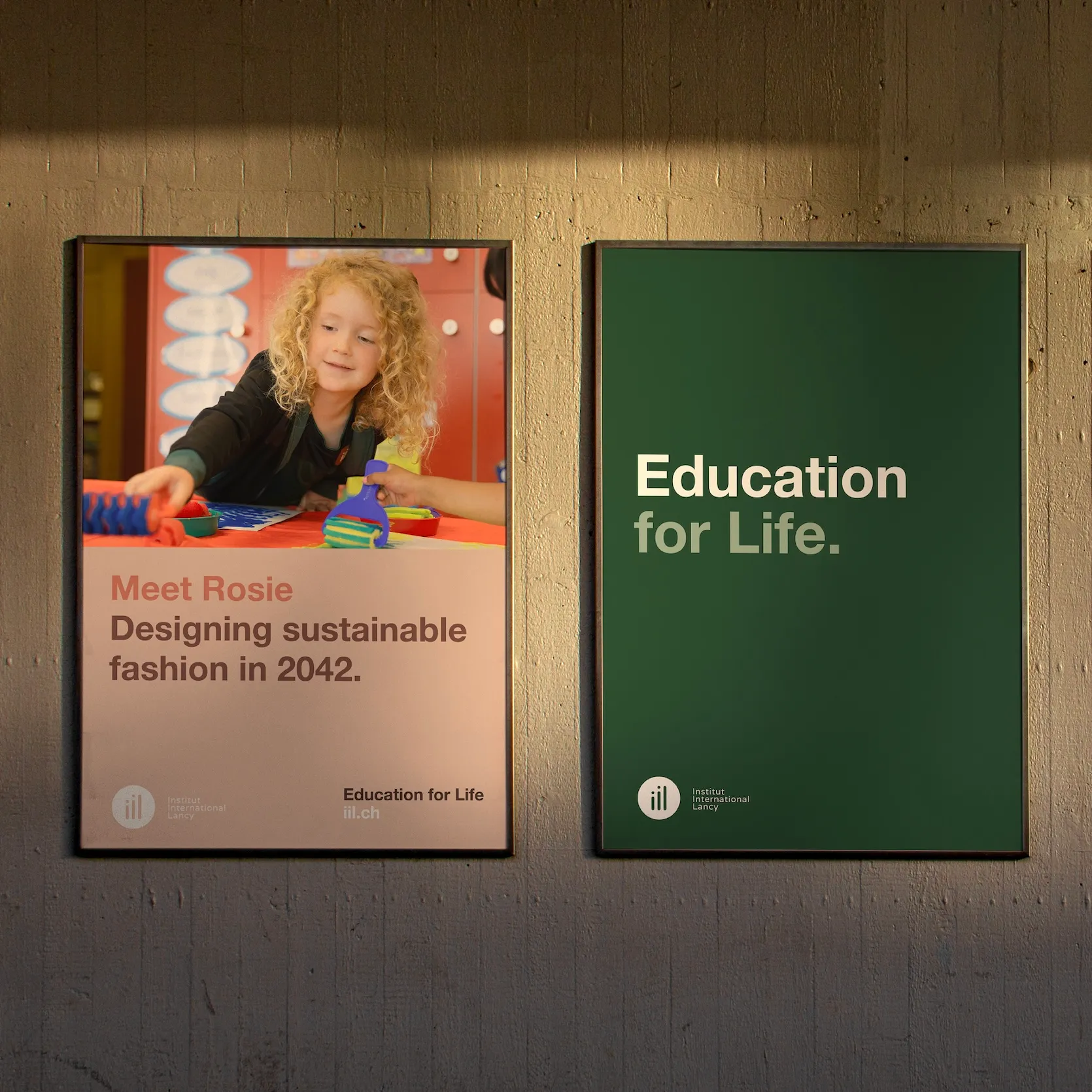
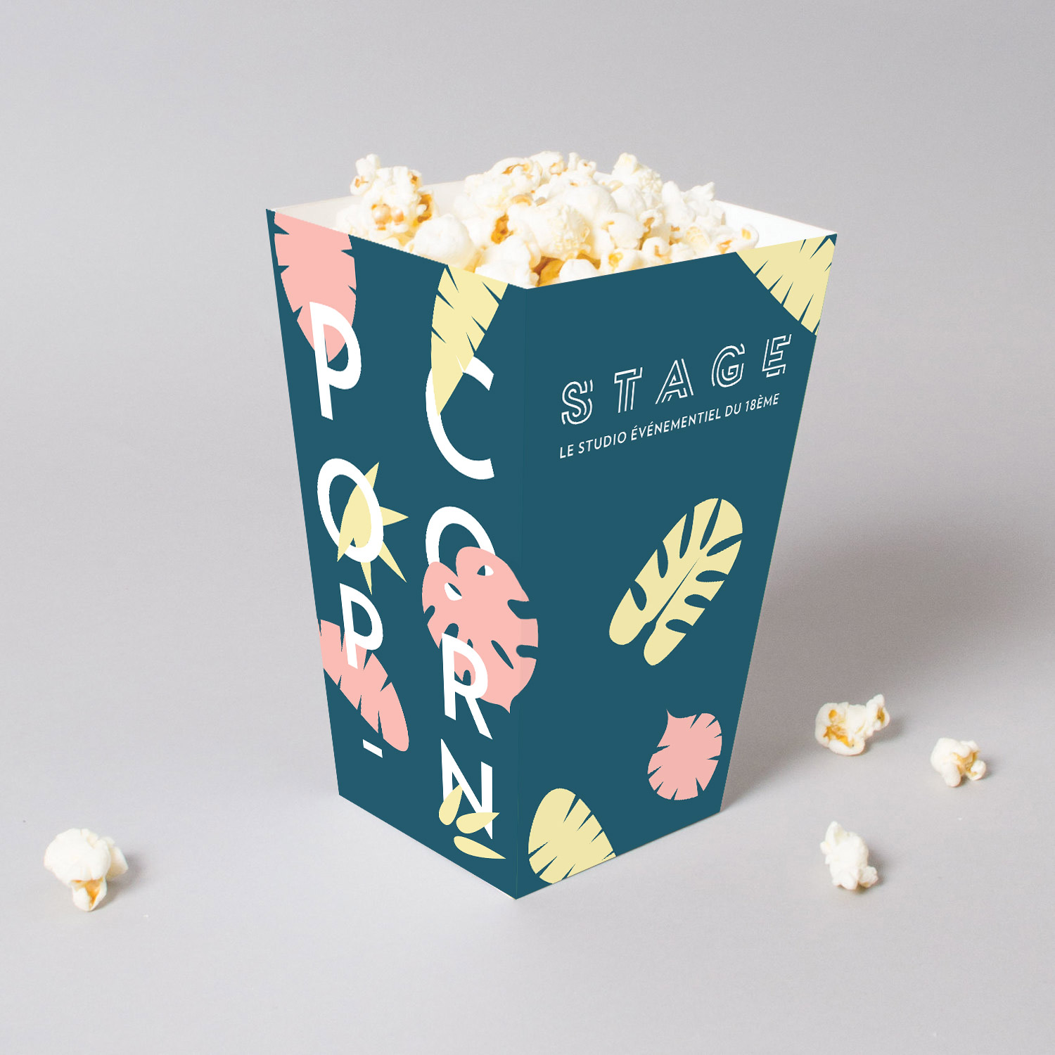
To help Parisian four-star Terrass” Hôtel boost seminar room bookings, we developed STAGE, a dedicated sub-brand positioned as a local events studio, with a fun, colourful identity distinct from the corporate style of competitors. This shift opened the door to a wide variety of events, from yoga classes and Sunday brunches to children’s film clubs.
Colours and Shapes: The Building Blocks
Colour, shape, texture and scale form the core vocabulary of a visual identity. When used with intent, they send the right message about your brand.
Colour is the first element the brain registers, creating an impression before conscious recognition.
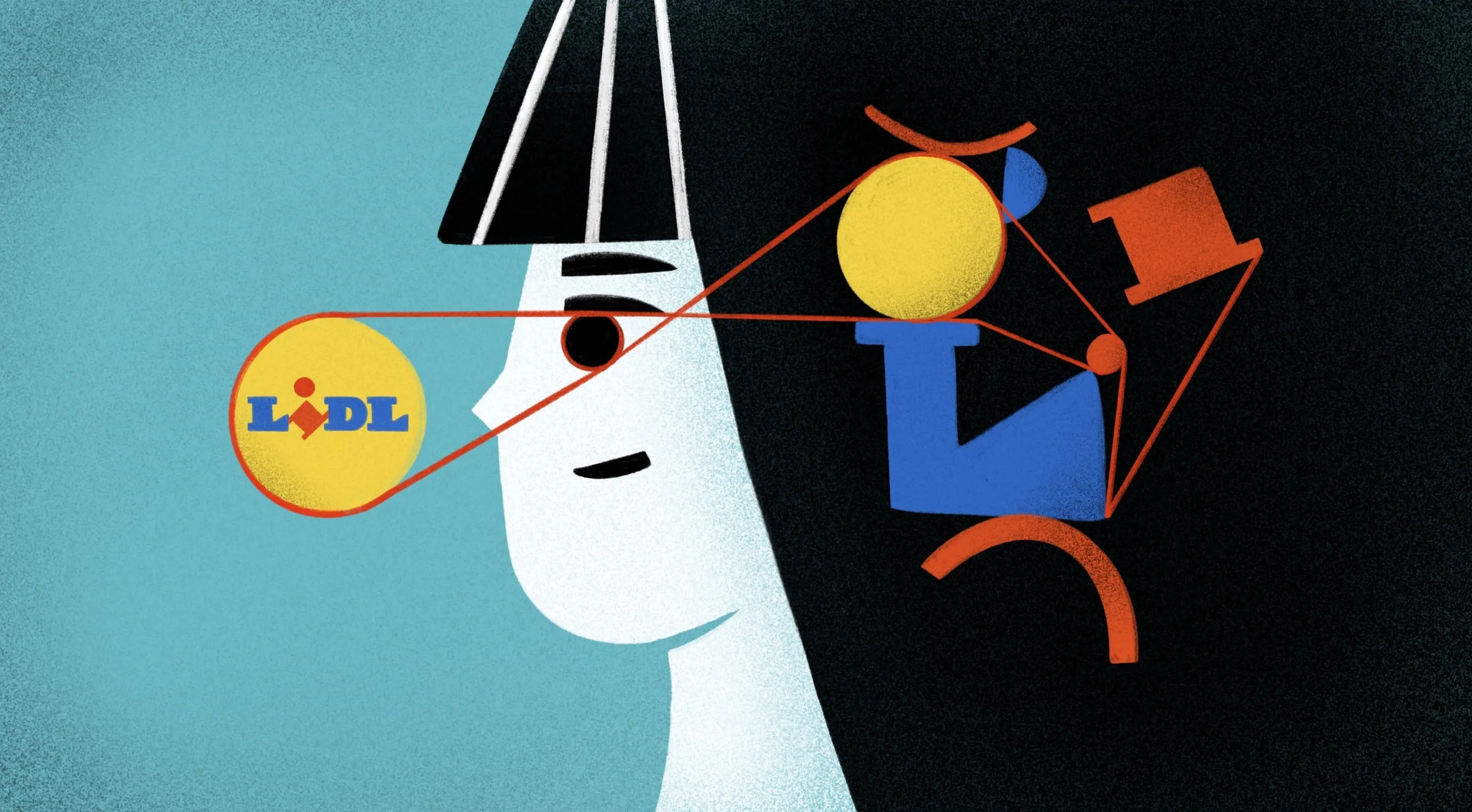
Take Lidl: its use of primary colours in a deliberately unsophisticated style communicates low cost, approachability, and mass appeal. The same colour strategy has long been used by fast-food giants such as KFC and Burger King.
By contrast, Globus Delicatessa’s black-and-white palette signals exclusivity. Avoiding primary colours elevates the perception of quality and price. Many luxury brands adopt similar schemes. In certain sectors, a brand can “own” a colour — Ferrari red, Tiffany blue, KUKA orange, or EasyJet orange — creating instant recognition and strong positive associations.
Shapes reinforce these messages, enabling brands to build more specific associations. TWG Tea of Singapore combines classic serif typography with a colonial-inspired aesthetic, evoking heritage and tradition, even though the brand was only launched in 2008!
Beyond the Logo: Creating a Visual System
A logo alone cannot define or sustain a brand. Without clear rules for its use, such as in layout, typography, colours, imagery and materials, consistency and recognisability suffer.
Even Nike’s iconic Swoosh is part of a larger visual system. Its impact relies on the space around the logo, the typeface used, the photography style, the colour palette, and more. All of this is documented in a brand’s graphic charter.
For example, when Geneva’s innovation incubator Fongit (Fondation Genevoise pour l’Innovation Technologique) asked us to rethink their brand strategy and redesign their visual identity, we created a modular system that allowed flexible layouts while maintaining clear rules. This balance ensured both consistency and creative freedom.

Standing Out without Standing Alone
A strong visual identity can put your brand in the spotlight. In many markets, differentiation is more achievable than most businesses assume. The challenge lies not in being noticed once, but in being remembered for the right reasons.
While every brand wants to be distinctive, most also follow certain category conventions. Low-fat milk, for instance, is unlikely to abandon its light-blue packaging any time soon. That's why your visual identity should strike the right balance: distinct enough to stand out, familiar enough to feel credible. In doing so, it becomes one of your most valuable business assets, shaping customer perceptions and influencing decisions long before your customer reads a single word.
Ready to Reimagine Your Brand's Visual Identity?
Whether you’re refreshing an outdated visual identity or building one from the ground up, brand design choices grounded in a clear brand strategy can unlock genuine business value.
At Creative Supply, we partner with companies across industries to create distinctive, future-proof brand identities that authentically express who they are and what they stand for.
👉 Contact us to explore how we can help your brand stand out and create a lasting impression.
The Subliminal Power of Visual Brand Identity

The Subliminal Power of Visual Brand Identity
What connects Jamie Oliver and Lidl? Discover how a carefully crafted visual identity can influence your customers’ subconscious, justify premium pricing, and set your brand apart from the competition.
Everyday Encounters with Brand Cues
Think back to your last supermarket visit. Shopping for low-fat milk? You probably went straight to the light blue packaging. Looking for men’s skincare? The abundance of black and navy signalled you were in the right section. In the pasta aisle, Jamie Oliver’s smiling face on a bag of jasmine rice may have inspired trust and familiarity. And that small green organic label on the vegetable display likely sent mixed signals to your brain: “more expensive, but better quality.”
Almost without realising, your brain decodes these visual signals to navigate a sea of choices. This is the power of visual identity, guiding purchasing decisions through subconscious associations.
Speaking to the Subconscious
Daniel Kahneman, Nobel Prize-winning psychologist and economist, distinguishes between two modes of thought:
- System 1: Fast, instinctive, emotional
- System 2: Slow, deliberate, logical
Research suggests that over 90% of mental activity happens in system 1. In branding terms, this means consumers often judge products in milliseconds, based solely on visual cues.
A brand’s visual identity — its logos, colours, shapes, typography, imagery and layout — creates the framework for these split-second perceptions. It is a strategic tool as much as a design one, shaping the way people recognise, categorise and value your offering.
In Biel, Swiss machine-tool manufacturer Strausak turned to us to help differentiate their brand. While competitors relied on technical or generic stock imagery, we embraced monochrome 3D renderings of machine parts — a minimalist aesthetic inspired by product design. This distinctive approach highlighted the usability and innovation of their machines.
Cognition First, Aesthetics Second
Visual identity is, above all, about cognition. Before exploring design aesthetics, a brand must define its strategic objectives.
Are you positioning your brand as luxury, affordable, or niche? Which associations should customers make when they see your brand? What key messages must your visual system convey?
Clear answers to these questions prevent subjective bias. It’s not about a founder’s personal preference for a colour or typeface, but about whether a particular combination, for example, dark blue with classic serif lettering, reinforces the intended brand positioning. That's why this strategic groundwork is essential for branding projects before moving to brand design.
To help Parisian four-star Terrass” Hôtel boost seminar room bookings, we developed STAGE, a dedicated sub-brand positioned as a local events studio, with a fun, colourful identity distinct from the corporate style of competitors. This shift opened the door to a wide variety of events, from yoga classes and Sunday brunches to children’s film clubs.
Colours and Shapes: The Building Blocks
Colour, shape, texture and scale form the core vocabulary of a visual identity. When used with intent, they send the right message about your brand.
Colour is the first element the brain registers, creating an impression before conscious recognition.
Take Lidl: its use of primary colours in a deliberately unsophisticated style communicates low cost, approachability, and mass appeal. The same colour strategy has long been used by fast-food giants such as KFC and Burger King.
By contrast, Globus Delicatessa’s black-and-white palette signals exclusivity. Avoiding primary colours elevates the perception of quality and price. Many luxury brands adopt similar schemes. In certain sectors, a brand can “own” a colour — Ferrari red, Tiffany blue, KUKA orange, or EasyJet orange — creating instant recognition and strong positive associations.
Shapes reinforce these messages, enabling brands to build more specific associations. TWG Tea of Singapore combines classic serif typography with a colonial-inspired aesthetic, evoking heritage and tradition, even though the brand was only launched in 2008!
Beyond the Logo: Creating a Visual System
A logo alone cannot define or sustain a brand. Without clear rules for its use, such as in layout, typography, colours, imagery and materials, consistency and recognisability suffer.
Even Nike’s iconic Swoosh is part of a larger visual system. Its impact relies on the space around the logo, the typeface used, the photography style, the colour palette, and more. All of this is documented in a brand’s graphic charter.
For example, when Geneva’s innovation incubator Fongit (Fondation Genevoise pour l’Innovation Technologique) asked us to rethink their brand strategy and redesign their visual identity, we created a modular system that allowed flexible layouts while maintaining clear rules. This balance ensured both consistency and creative freedom.
Standing Out without Standing Alone
A strong visual identity can put your brand in the spotlight. In many markets, differentiation is more achievable than most businesses assume. The challenge lies not in being noticed once, but in being remembered for the right reasons.
While every brand wants to be distinctive, most also follow certain category conventions. Low-fat milk, for instance, is unlikely to abandon its light-blue packaging any time soon. That's why your visual identity should strike the right balance: distinct enough to stand out, familiar enough to feel credible. In doing so, it becomes one of your most valuable business assets, shaping customer perceptions and influencing decisions long before your customer reads a single word.
Ready to Reimagine Your Brand's Visual Identity?
Whether you’re refreshing an outdated visual identity or building one from the ground up, brand design choices grounded in a clear brand strategy can unlock genuine business value.
At Creative Supply, we partner with companies across industries to create distinctive, future-proof brand identities that authentically express who they are and what they stand for.
👉 Contact us to explore how we can help your brand stand out and create a lasting impression.
DownloadThe Subliminal Power of Visual Brand Identity
Download
Everyday Encounters with Brand Cues
Think back to your last supermarket visit. Shopping for low-fat milk? You probably went straight to the light blue packaging. Looking for men’s skincare? The abundance of black and navy signalled you were in the right section. In the pasta aisle, Jamie Oliver’s smiling face on a bag of jasmine rice may have inspired trust and familiarity. And that small green organic label on the vegetable display likely sent mixed signals to your brain: “more expensive, but better quality.”
Almost without realising, your brain decodes these visual signals to navigate a sea of choices. This is the power of visual identity, guiding purchasing decisions through subconscious associations.
Speaking to the Subconscious
Daniel Kahneman, Nobel Prize-winning psychologist and economist, distinguishes between two modes of thought:
- System 1: Fast, instinctive, emotional
- System 2: Slow, deliberate, logical
Research suggests that over 90% of mental activity happens in system 1. In branding terms, this means consumers often judge products in milliseconds, based solely on visual cues.
A brand’s visual identity — its logos, colours, shapes, typography, imagery and layout — creates the framework for these split-second perceptions. It is a strategic tool as much as a design one, shaping the way people recognise, categorise and value your offering.
In Biel, Swiss machine-tool manufacturer Strausak turned to us to help differentiate their brand. While competitors relied on technical or generic stock imagery, we embraced monochrome 3D renderings of machine parts — a minimalist aesthetic inspired by product design. This distinctive approach highlighted the usability and innovation of their machines.
Cognition First, Aesthetics Second
Visual identity is, above all, about cognition. Before exploring design aesthetics, a brand must define its strategic objectives.
Are you positioning your brand as luxury, affordable, or niche? Which associations should customers make when they see your brand? What key messages must your visual system convey?
Clear answers to these questions prevent subjective bias. It’s not about a founder’s personal preference for a colour or typeface, but about whether a particular combination, for example, dark blue with classic serif lettering, reinforces the intended brand positioning. That's why this strategic groundwork is essential for branding projects before moving to brand design.
To help Parisian four-star Terrass” Hôtel boost seminar room bookings, we developed STAGE, a dedicated sub-brand positioned as a local events studio, with a fun, colourful identity distinct from the corporate style of competitors. This shift opened the door to a wide variety of events, from yoga classes and Sunday brunches to children’s film clubs.
Colours and Shapes: The Building Blocks
Colour, shape, texture and scale form the core vocabulary of a visual identity. When used with intent, they send the right message about your brand.
Colour is the first element the brain registers, creating an impression before conscious recognition.
Take Lidl: its use of primary colours in a deliberately unsophisticated style communicates low cost, approachability, and mass appeal. The same colour strategy has long been used by fast-food giants such as KFC and Burger King.
By contrast, Globus Delicatessa’s black-and-white palette signals exclusivity. Avoiding primary colours elevates the perception of quality and price. Many luxury brands adopt similar schemes. In certain sectors, a brand can “own” a colour — Ferrari red, Tiffany blue, KUKA orange, or EasyJet orange — creating instant recognition and strong positive associations.
Shapes reinforce these messages, enabling brands to build more specific associations. TWG Tea of Singapore combines classic serif typography with a colonial-inspired aesthetic, evoking heritage and tradition, even though the brand was only launched in 2008!
Beyond the Logo: Creating a Visual System
A logo alone cannot define or sustain a brand. Without clear rules for its use, such as in layout, typography, colours, imagery and materials, consistency and recognisability suffer.
Even Nike’s iconic Swoosh is part of a larger visual system. Its impact relies on the space around the logo, the typeface used, the photography style, the colour palette, and more. All of this is documented in a brand’s graphic charter.
For example, when Geneva’s innovation incubator Fongit (Fondation Genevoise pour l’Innovation Technologique) asked us to rethink their brand strategy and redesign their visual identity, we created a modular system that allowed flexible layouts while maintaining clear rules. This balance ensured both consistency and creative freedom.
Standing Out without Standing Alone
A strong visual identity can put your brand in the spotlight. In many markets, differentiation is more achievable than most businesses assume. The challenge lies not in being noticed once, but in being remembered for the right reasons.
While every brand wants to be distinctive, most also follow certain category conventions. Low-fat milk, for instance, is unlikely to abandon its light-blue packaging any time soon. That's why your visual identity should strike the right balance: distinct enough to stand out, familiar enough to feel credible. In doing so, it becomes one of your most valuable business assets, shaping customer perceptions and influencing decisions long before your customer reads a single word.
Ready to Reimagine Your Brand's Visual Identity?
Whether you’re refreshing an outdated visual identity or building one from the ground up, brand design choices grounded in a clear brand strategy can unlock genuine business value.
At Creative Supply, we partner with companies across industries to create distinctive, future-proof brand identities that authentically express who they are and what they stand for.
👉 Contact us to explore how we can help your brand stand out and create a lasting impression.


.gif)
%20copy.gif)