Florella
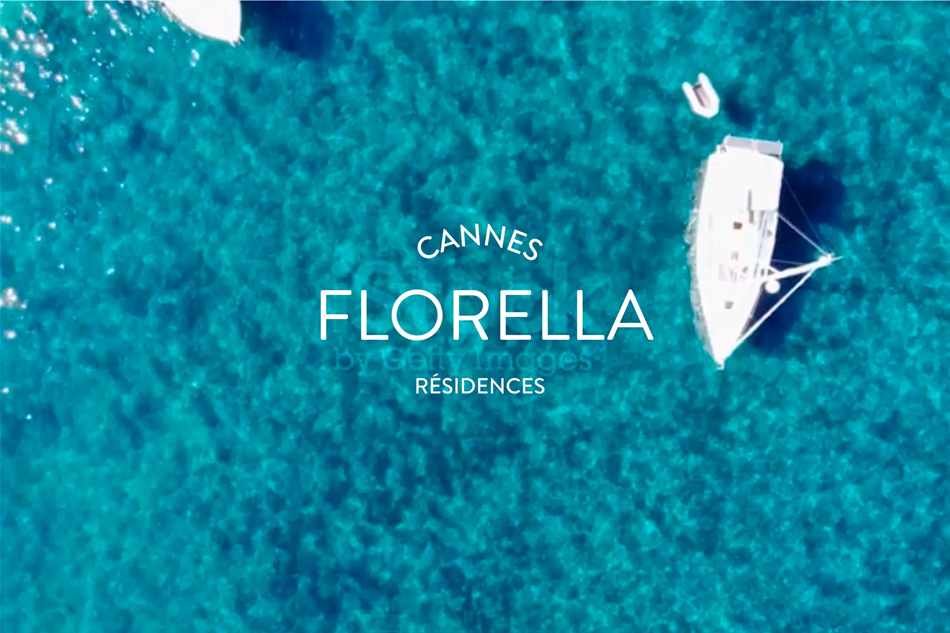
A fresh identity for Cannes' largest residence brand
Florella
Industry
Hospitality & Retail
Location
Cannes/France
Services
Featured
Client’s mission
Modernise the visual identity and website of Florella Résidences to better reflect the quality of their properties and the spirit of their team.
Creative Supply challenge
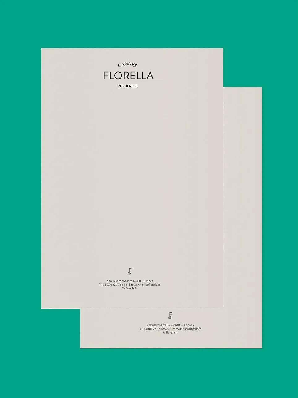
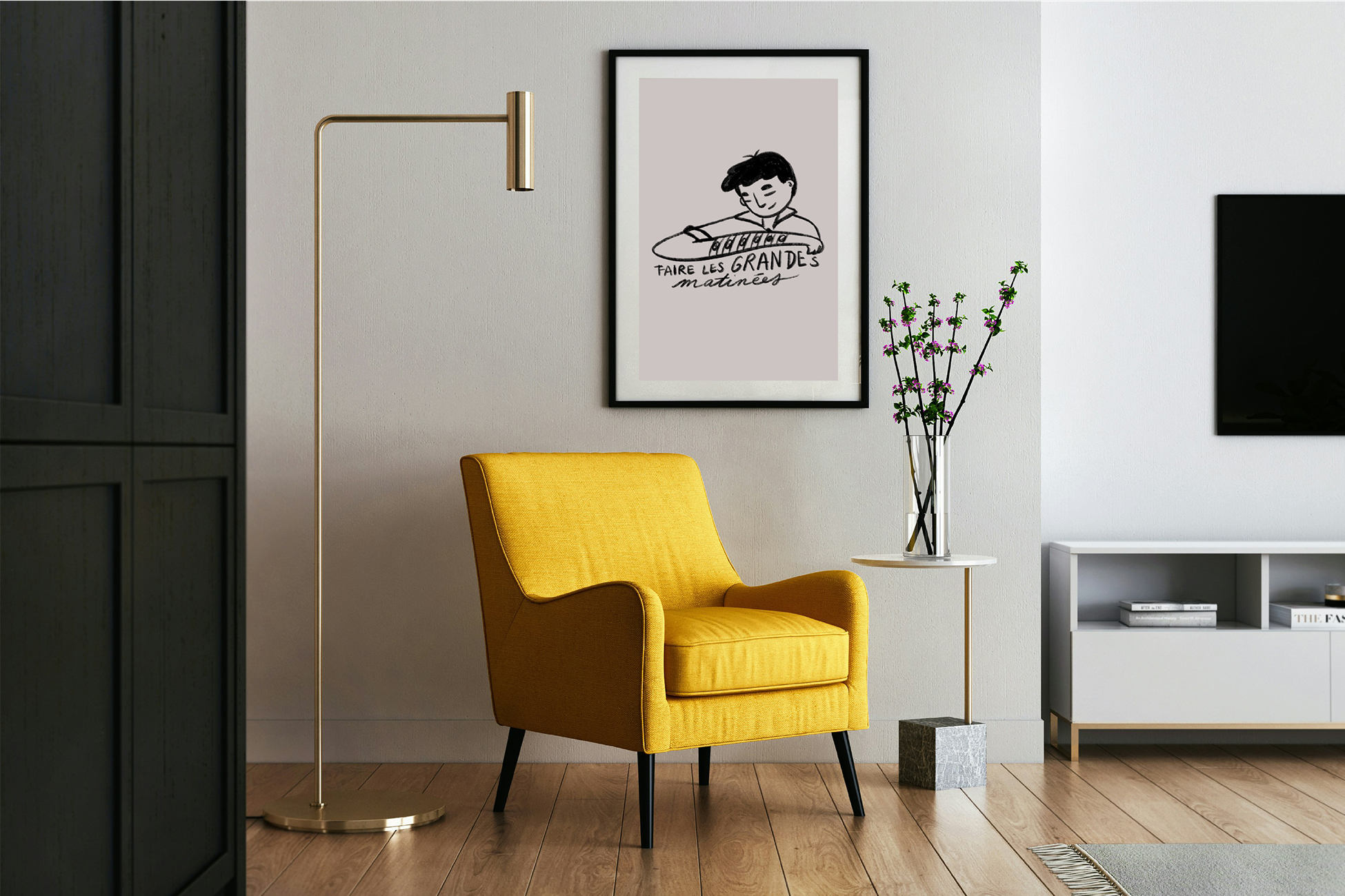
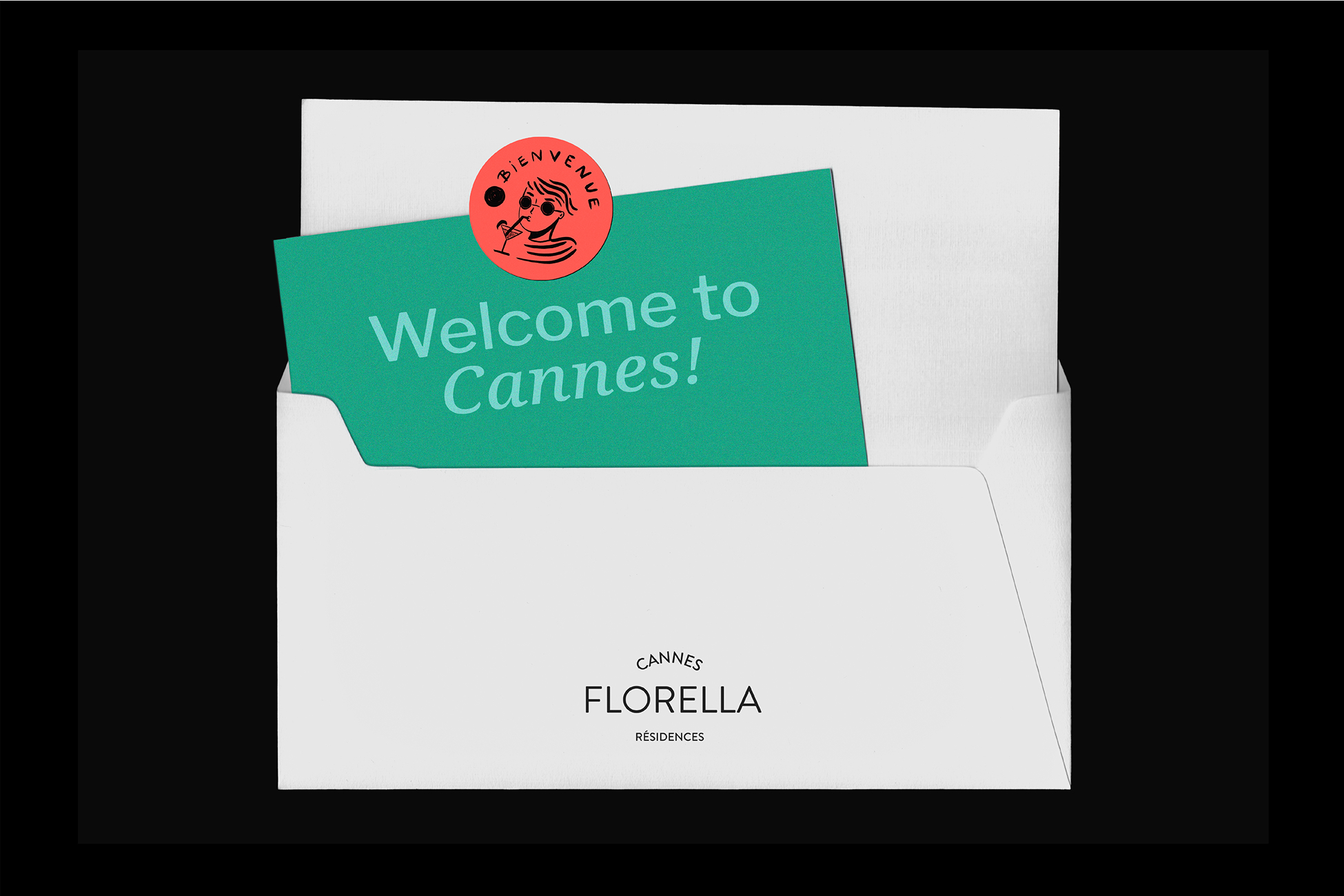
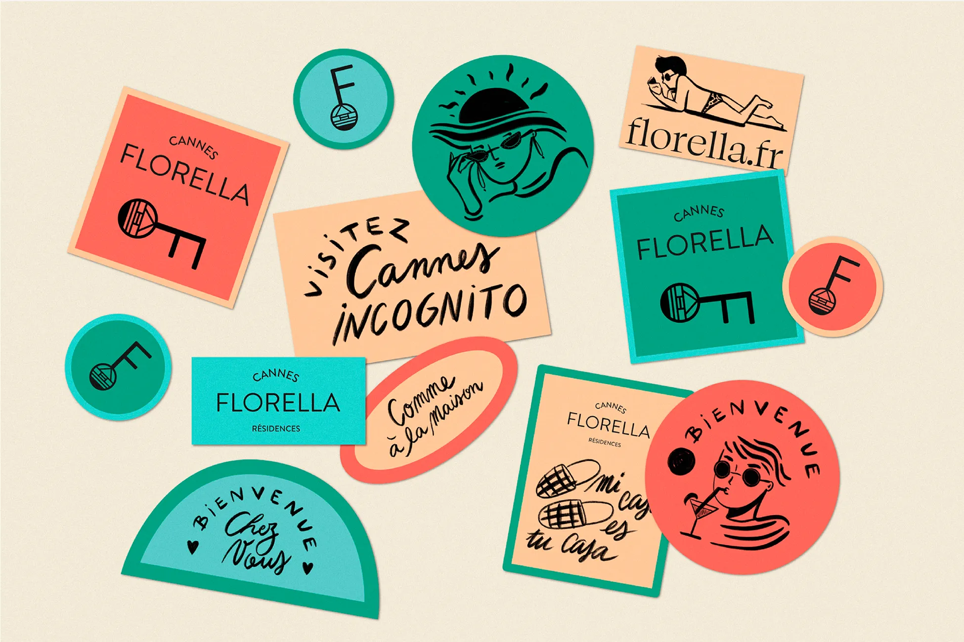
Develop a distinctive visual identity that conveys local expertise and personal touch.
Strategic direction
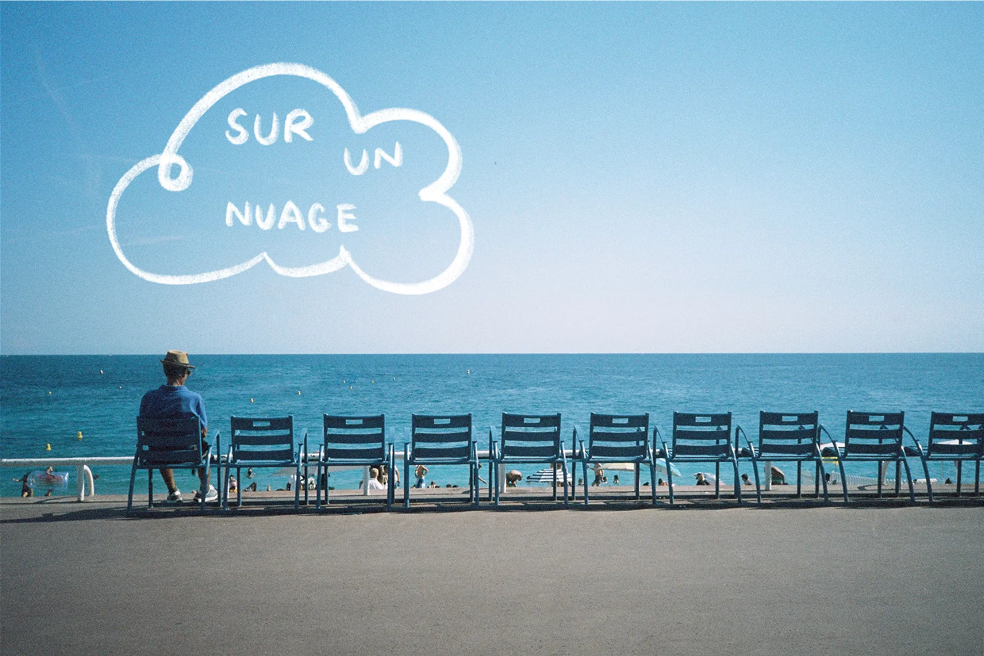
Position Florella as a local character, bringing new vitality to Cannes through premium services and community collaborations.
Creative direction
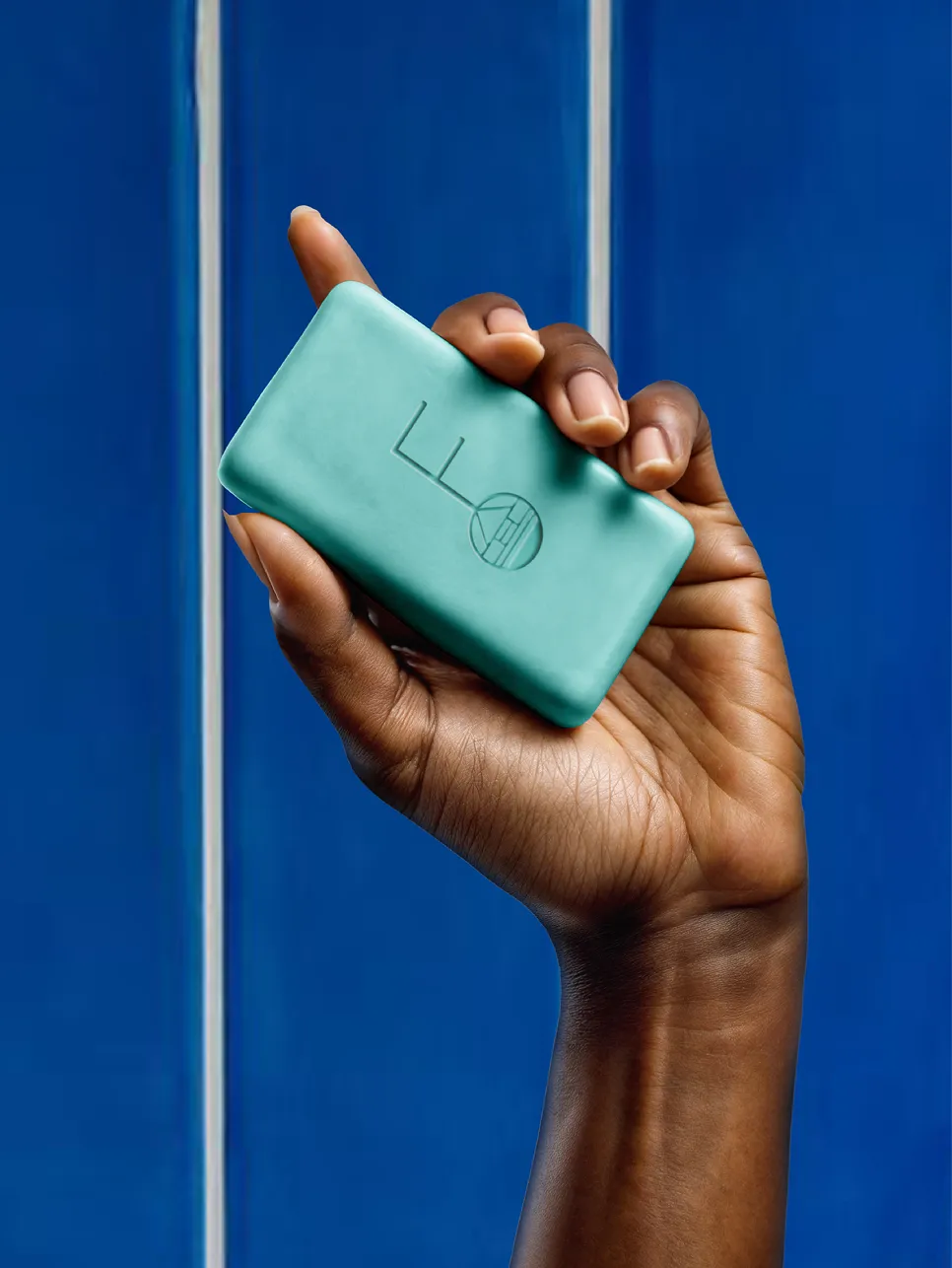
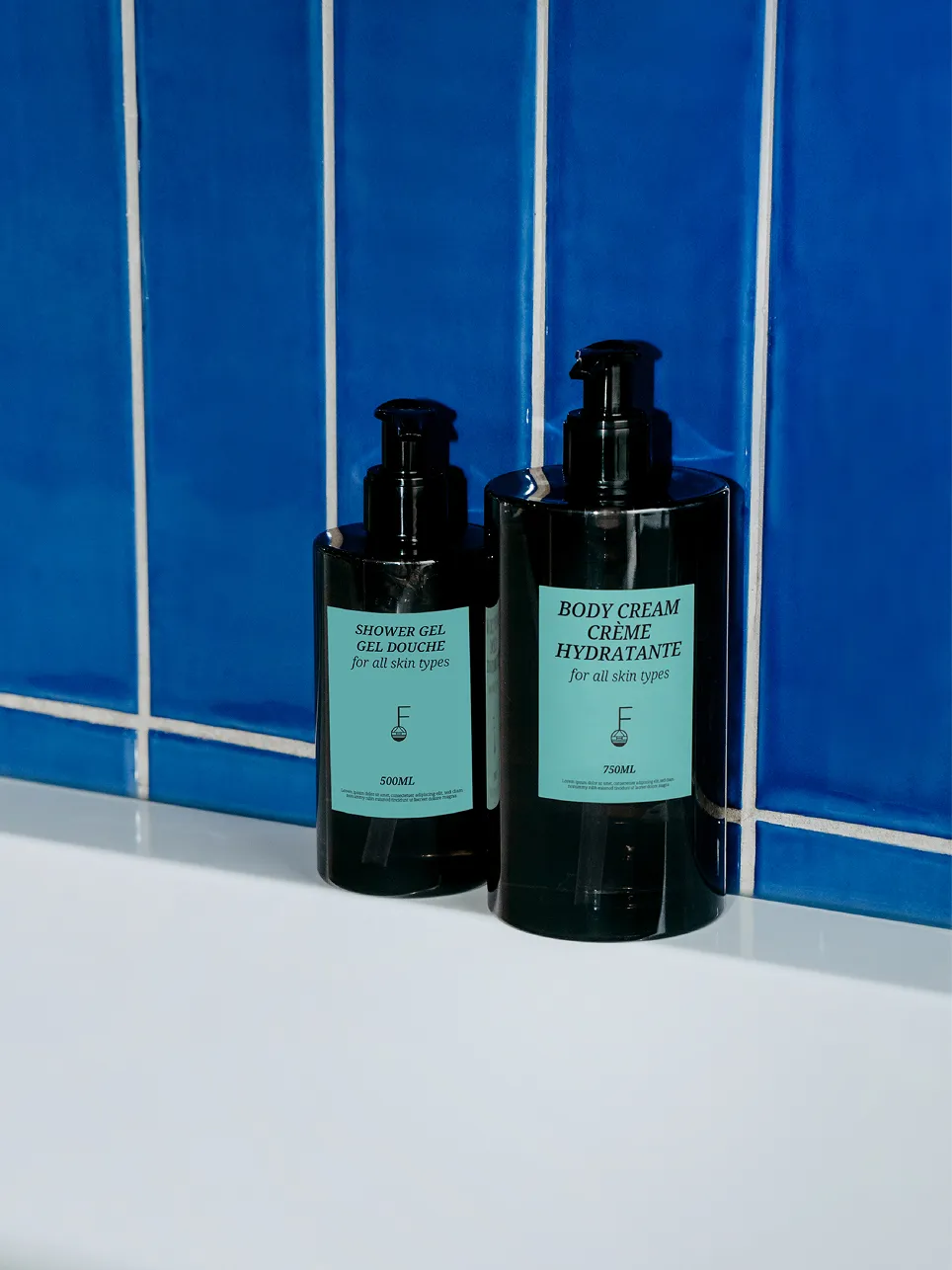
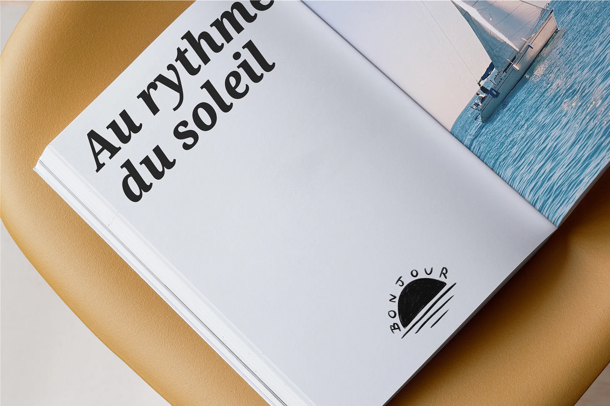
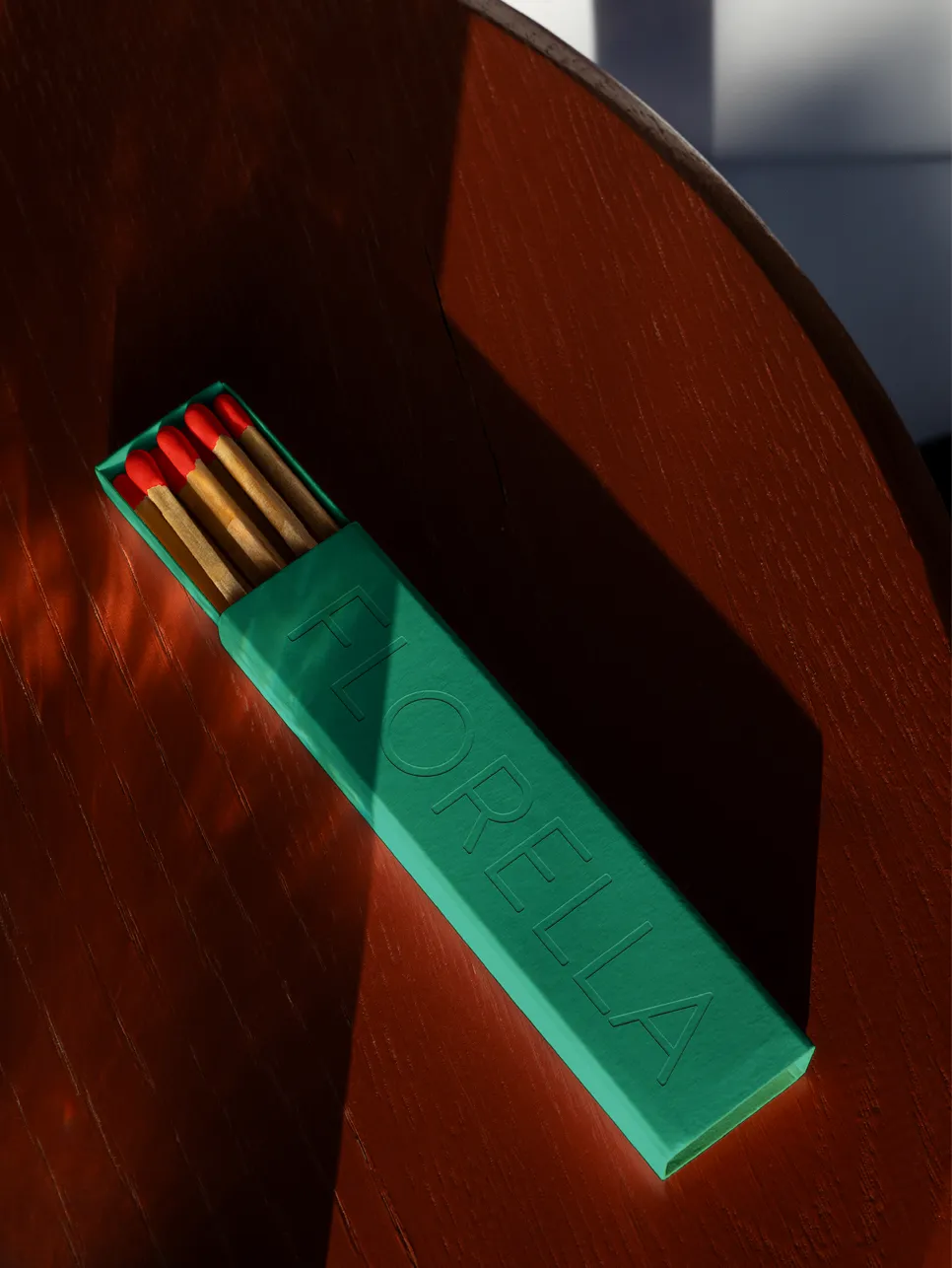
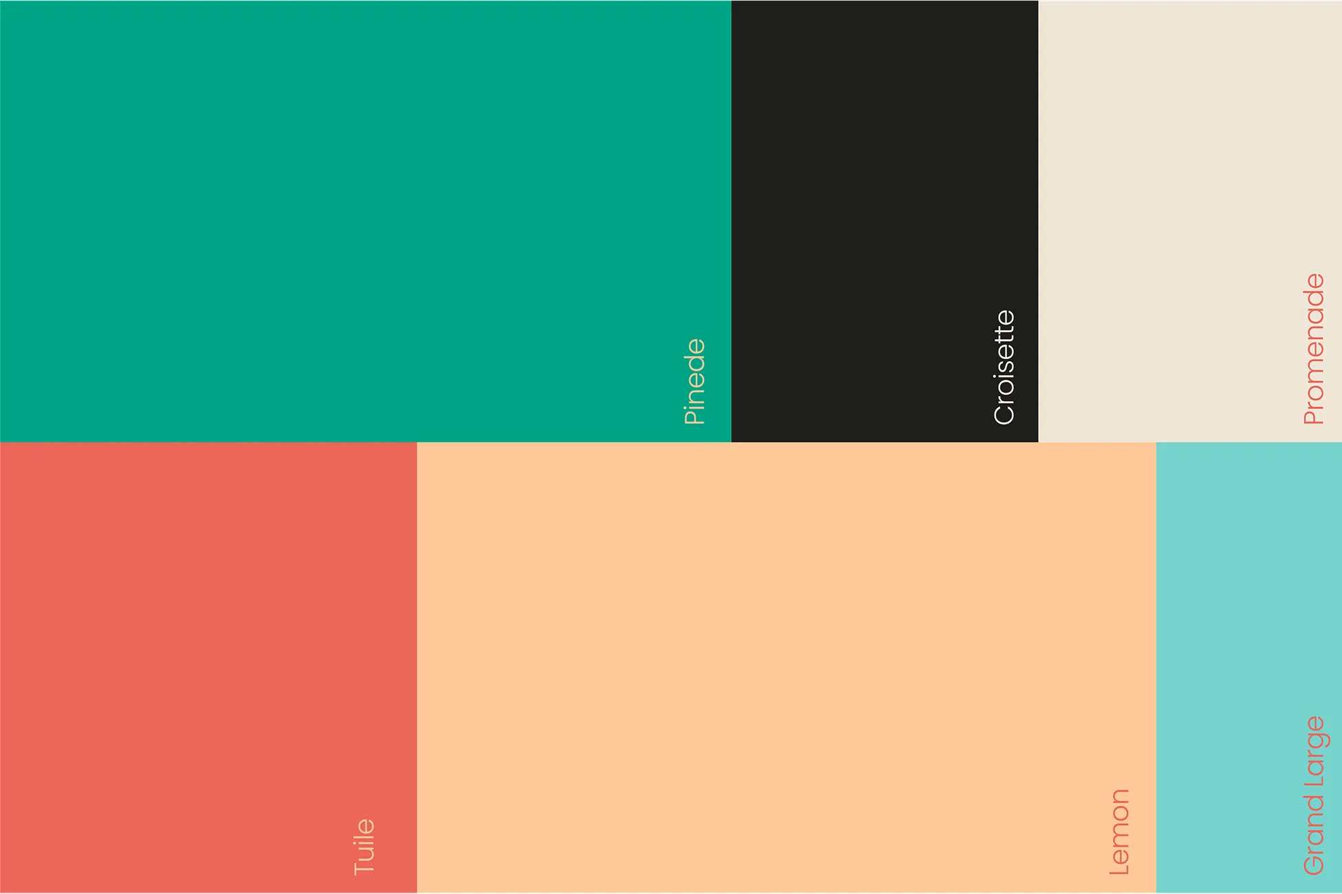
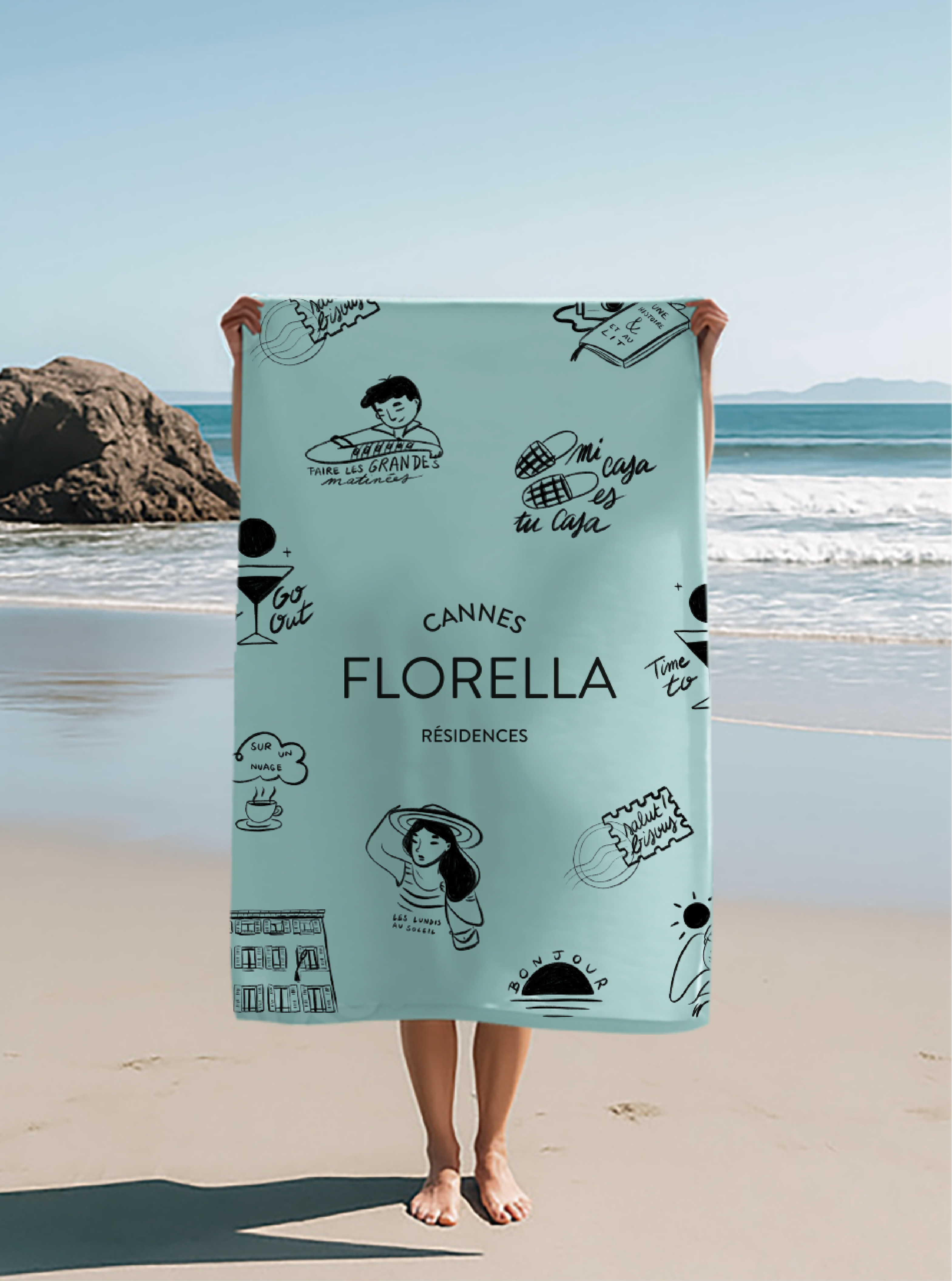
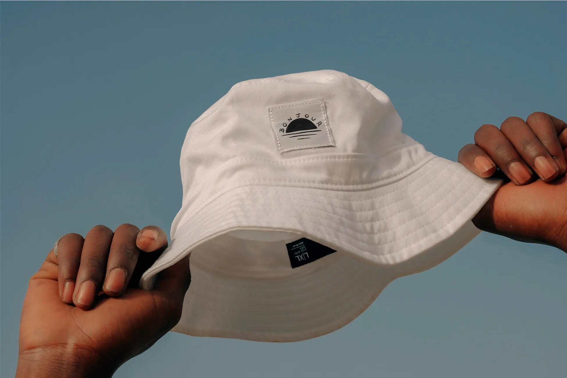
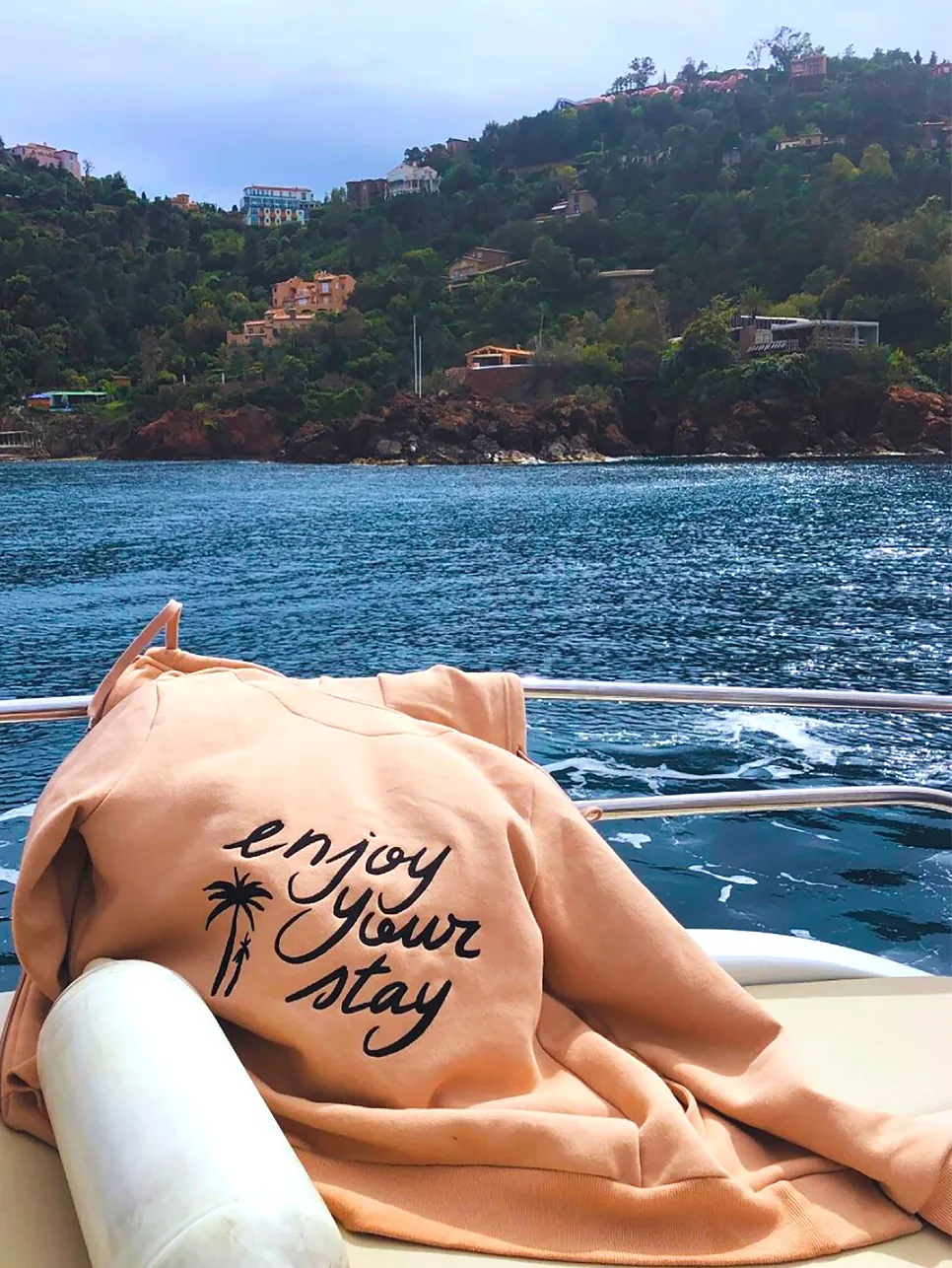
An F-shaped key symbol and colours inspired by the sun, landscapes, and sea of the Côte d’Azur.
The highlight
Florella’s bold rebrand signalled a new era for Cannes’ largest residences group — helping the brand break out of a generic hospitality space and assert its identity as a premium local player with global standards.
Florella Team
“We collaborated with Creative Supply in order to give our image a new look and to define our values, our style and our brand. Each member of the team was able to meet our expectations with quality work in an ultra-friendly environment! We recommend Creative Supply with our eyes closed.”
No items found.
No items found.



No items found.
No items found.


No items found.
No items found.


No items found.
No items found.


No items found.
No items found.


No items found.
No items found.


No items found.
No items found.


No items found.

No items found.


No items found.
No items found.


Join 10,000+ executives who trust our monthly insights on branding, experience design and digital strategy.
Done. Check your mailbox (and spam).
Oops! Something went wrong while submitting the form.
