About the project
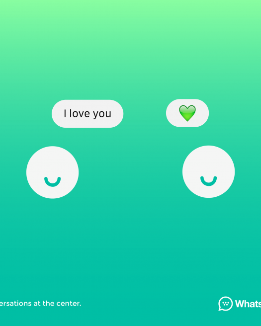
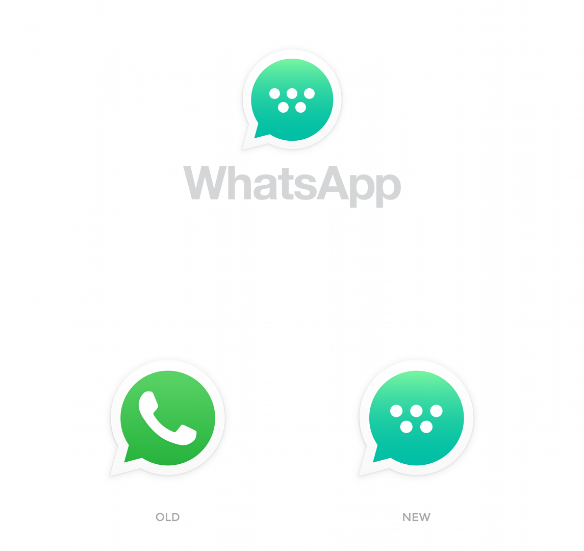
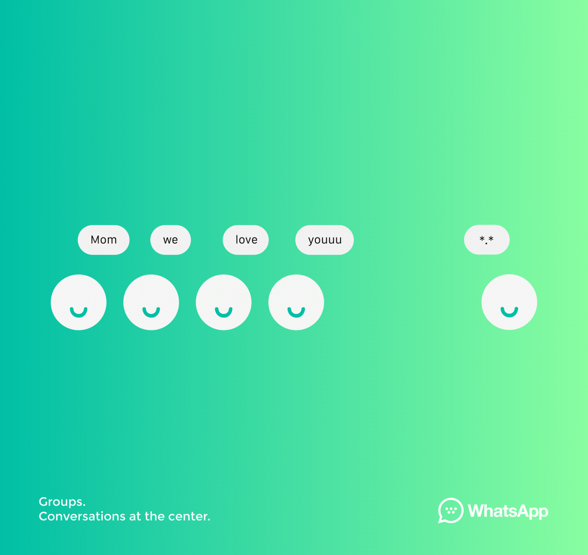
WhatsApps’ safe and familiar design has been remaining untouched for longer than it should have. Or at least that was what Marcello Di Giovanni, an Italian designer specialising in Brand and UI/UX Design, thought when he reimagined the popular app’s visual identity while being respectful to its current brand design core. He added trendy gradients to WhatsApp’s plain green scheme and boldly replaced the core element of the existing logo – the phone – substituting it with more conceptual “dots”. The circle shape theme is carried across the whole design spectrum, from user icons to status indicators. Minimalist and user friendly, this design could certainly freshen up the interface of everyone’s beloved app’s!
Where did you study design?
I studied science of communication and marketing at University in Italy but never studied about design (I’m a self-taught).
Who do you look up to in your industry?
I don’t follow a lot designers in my sector, but I love creativity in general, and for me following Fashion designer, modern artist and industrial designer is a great way to animate my creativity.
What are, in your opinion, most significant brand design trends this year?
I think this year the trends are predominant simplicity in the forms and essential geometric shapes. I see a lot of adaptability in contexts and therefore dynamism and also an interest in responsive. Vivid colours, perfect for digital media and creation of a coherent brand identity.
Image credits © Marcello Di Giovanni