About the project
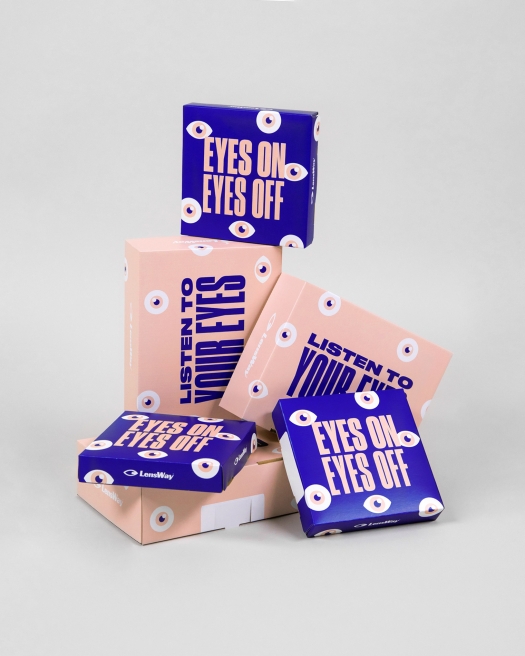
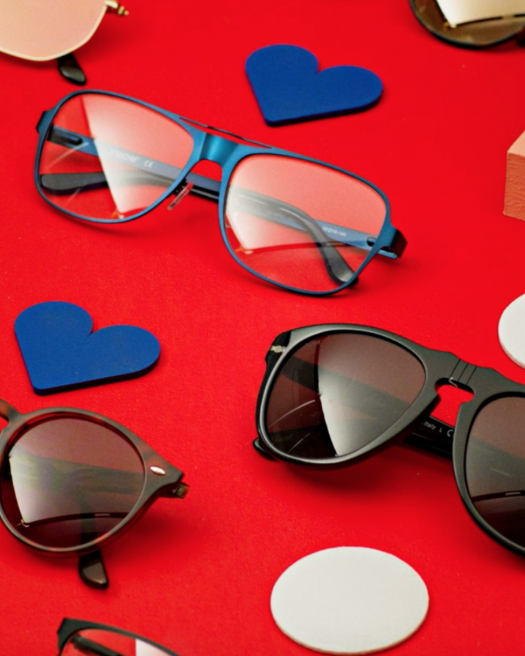
Founded in 2000 Lensway has grown to be one of Europe’s largest retailer for lenses and eye-wear. During the quick growth the brand quickly lost it’s direction and the company found itself with a great customer base but with low loyalty. The problem was that the brand lacked a personality and a tone of voice. Snask got the assignment to modernize Lensway and create a brand that had it’s own unique style as well as feel to it.
We asked them to share how they tackled this challenge:
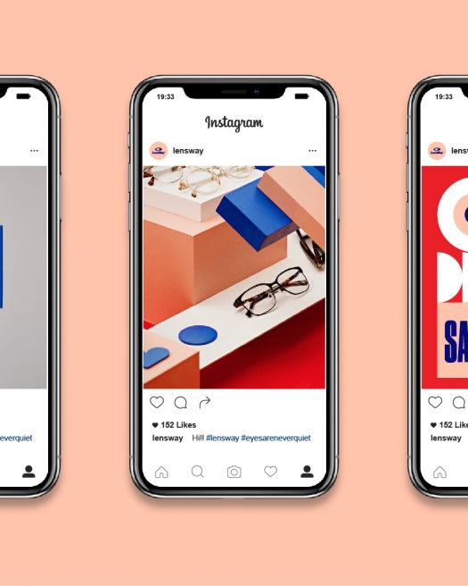
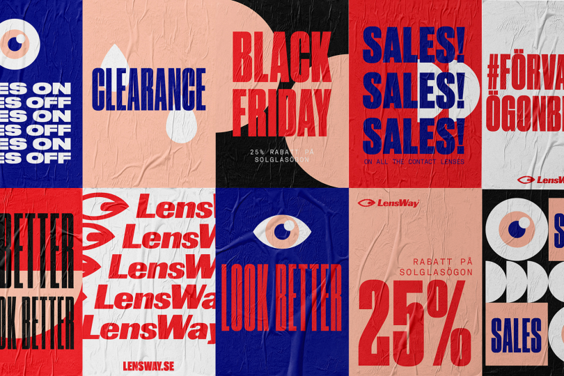
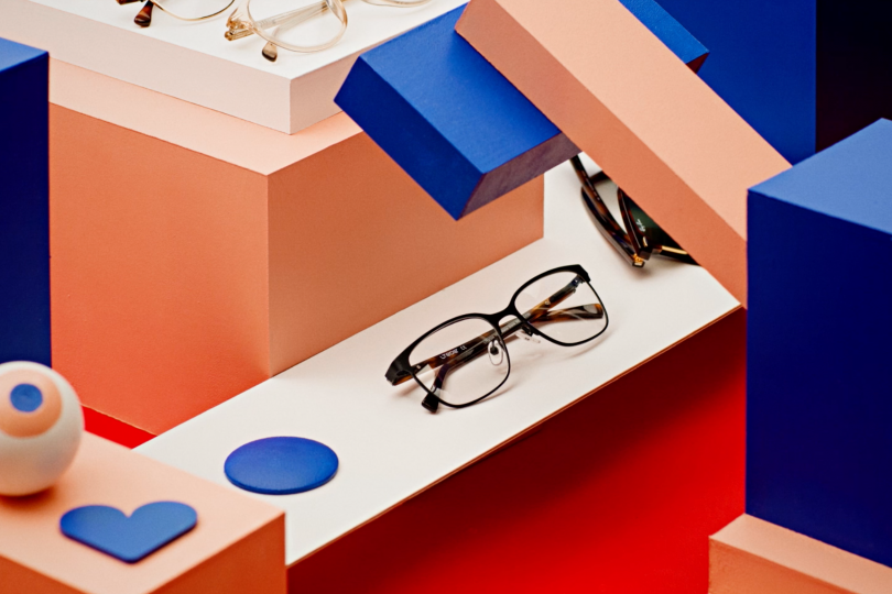
“We knew that the brand was in big need of a visual remake”, Snask confessed to us. “Everything except the logo was up for grabs and we focused a lot around eyes in iconography and patterns and chose a typography that was versatile, playful and unique yet easy to read. We decided to intensify the brands red color and also add an equally strong blue together with a lighter peach pink. Along the identity we also created a lot of photos and films for SoMe, other online media as well as TV.”
Where did you study design?
Cumbria Institute of the Arts in Carlisle, UK
Who do you look up to in your industry?
The young people breaking laws and grids!
What are, in your opinion, most significant brand design trends this year?
To not go by trends at all. and simply do what you, as a creative individual, think is beautiful… rather than what anyone else will think.
Image credits © Snask Behance Page