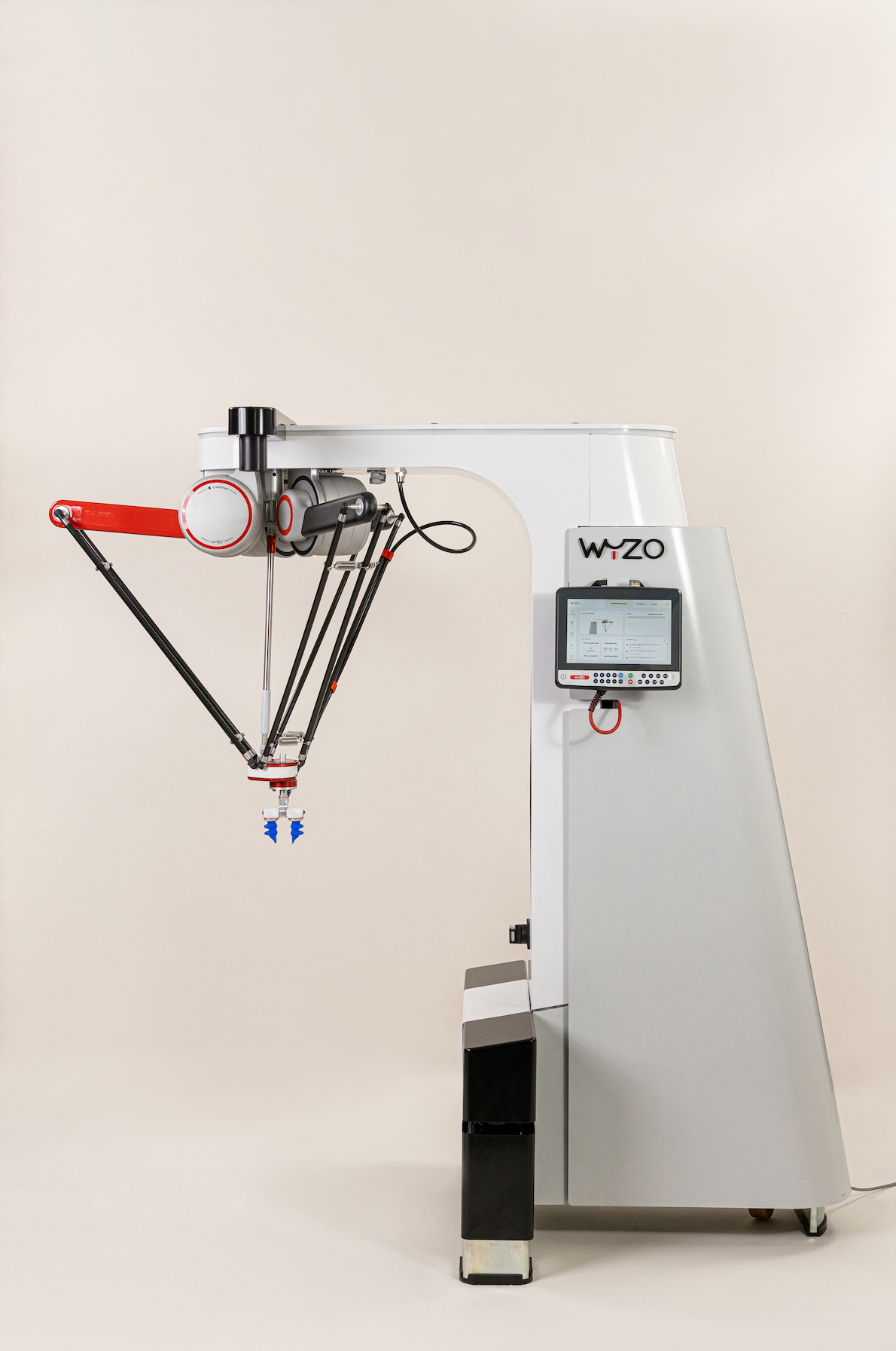
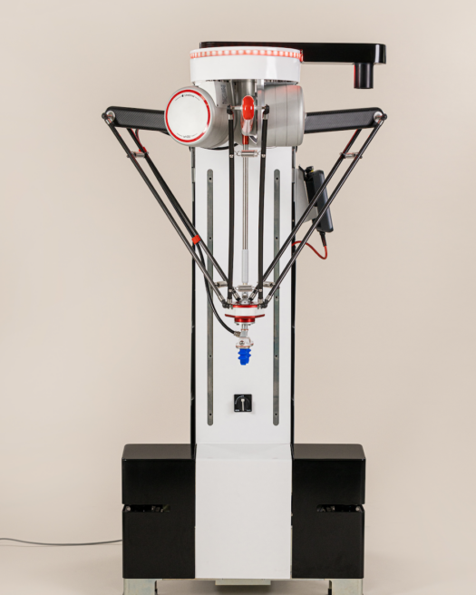
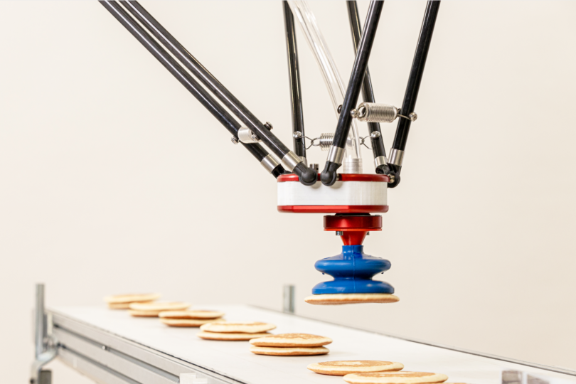
Wyzo is the first side-bot industrially designed to perform tasks alongside humans in complete safety. We worked hand in hand with its creator to develop the brand for the new and revolutionary robot.
To help clients automate production chains, a pioneer in “pick & place” robot manufacturing developed a new type of robot designed to work safely alongside human workers: the side-bot. Creative Supply was called upon with a twofold mission aimed to shine a spotlight on their breakthrough innovation. The mission: developing a new dedicated brand for the side-bot and its ecosystem and designing the app for controlling and configuring the machine.

From machine to side-bot
Sometimes, when it comes to high-tech projects, it’s necessary to forge a new term or category for products or services. With Wyzo, it was important to differentiate the bot from “conventional” industrial robots conceived to handle large volumes in an environment isolated from all human contact, and cobots (collaborative robots), a catch-all category for all robots designed to interact with humans. This is why we created the term “side-bot,” a short-wheelbase robot that easily integrates into production lines with human operators too. The name Wyzo was chosen for its likeable, modern feel and because it alludes to “wizard” or “wiz,” as in gifted, and “whiz,” as in speedy. Wyzo thus refers to both the brand and the product, which enhances recognizability in the launch phase.
| Sidebot | Industrial robot | Cobot |
| Designed to work autonomously in open environments where humans work too. Sidebots are easy to install and program, and adjust themselves in real time to maximize productivity while ensuring the safety of other workers. | Developed for large-scale, fully automated assembly lines or production lines. Very productive despite complex installation and programming. | Robots created to interact directly with humans. Cobots are not generally designed to work autonomously but rather assist human operators. |
A cutting-edge visual identity
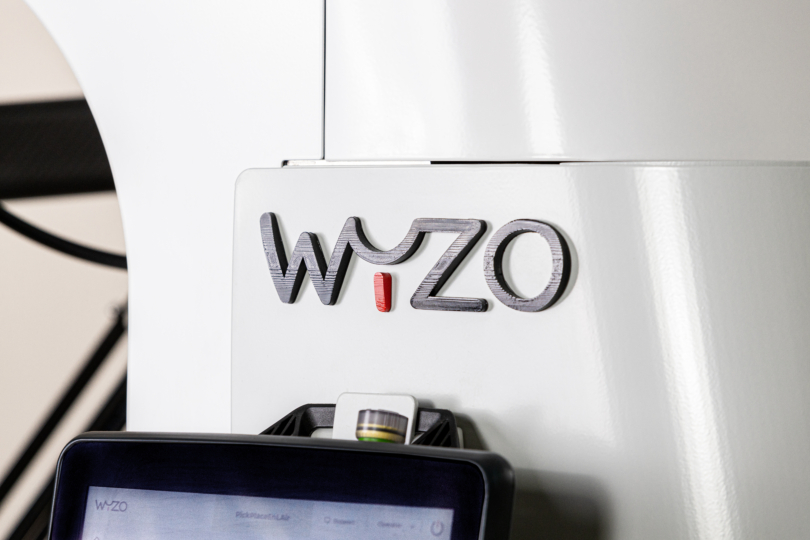
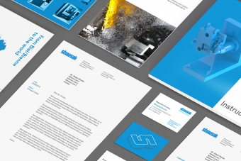
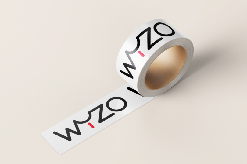
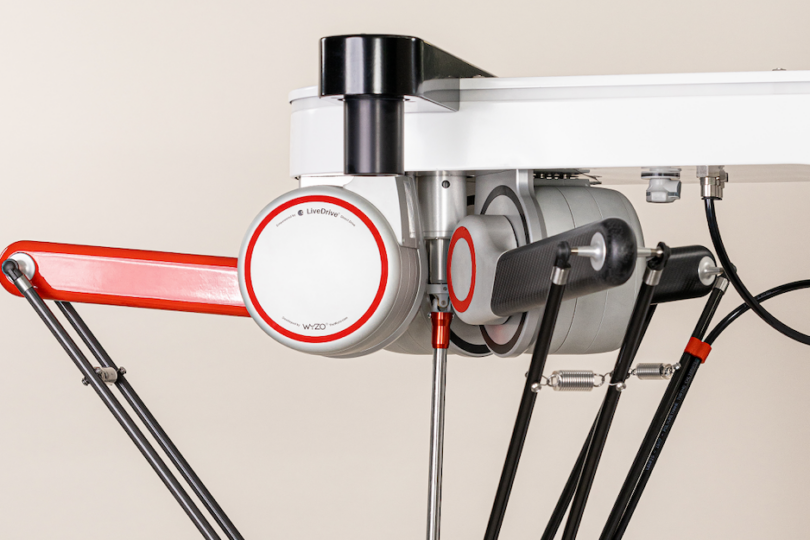
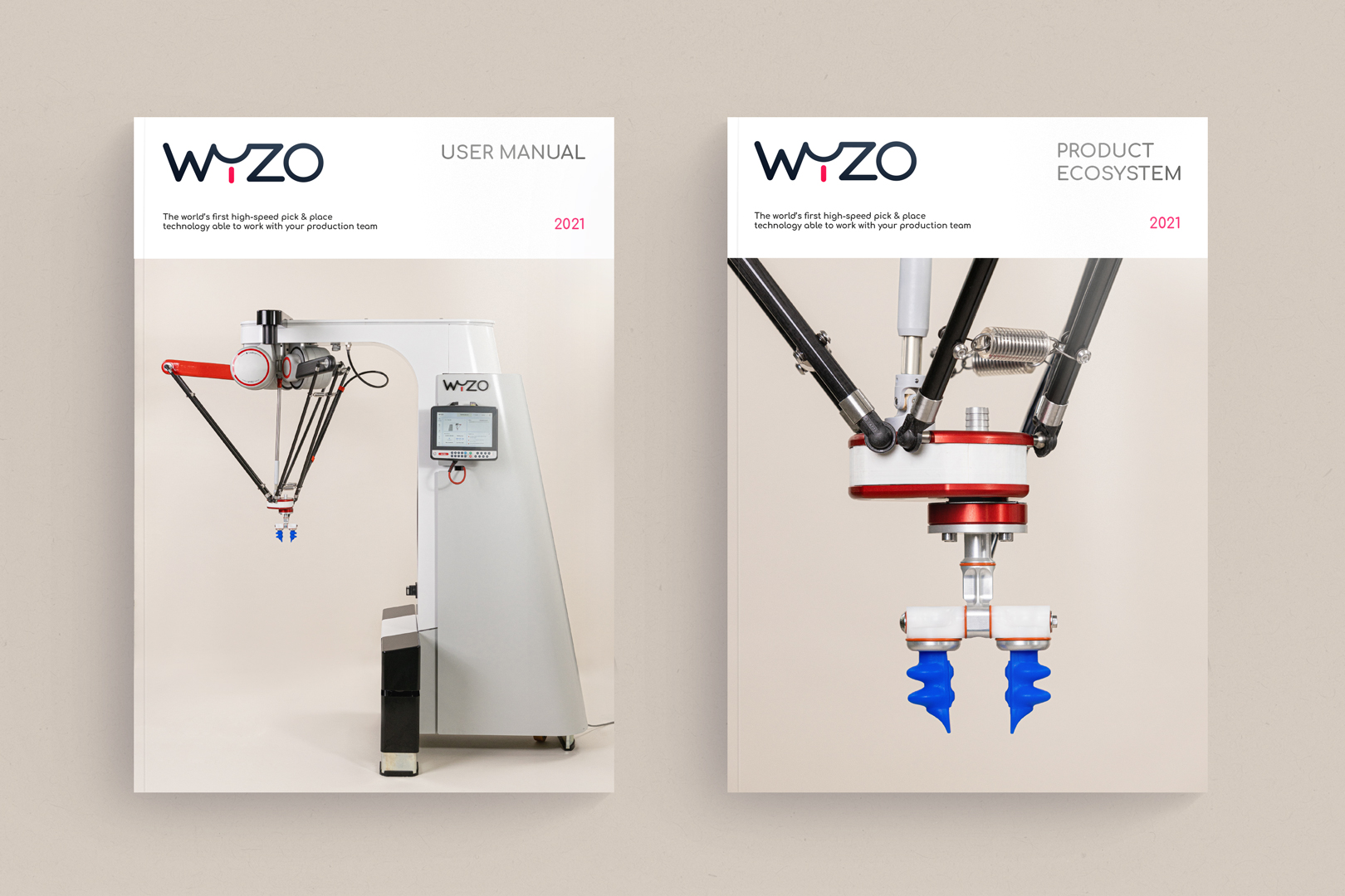
Like the name Wyzo, a visual identity was created from scratch by our art director Aloïs Ancenay, thinking forward to future developments of the brand. The “y” shape in the logo resembles that of the bot’s arm, the main part that allows for objects to be manipulated. The rounded contours and the seams between the letters reinforce the notion of a bond between man and machine, underpinning the idea of a safe, unscary robot. These considerations are reflected in the choice of a font with rounded edges and a colour pallet alternating between tech standards (metallic grey, black and red) and much warmer hues (yellow, ochre and purple). A range of logo variations was also drawn up to accompany the brand in its future developments, most importantly the emergence of an ecosystem of other products and services around Wyzo.
“We asked Creative Supply to develop a new brand and a new user interface for a new generation of robots. Creative Supply’s expertise in the B2B sector, as well as their UX design skills, enabled us to take this project beyond our expectations. The quality of their work and their responsiveness convinced our engineers as well as our sales and marketing team.”
, CEO, WYZO
A benchmark interface
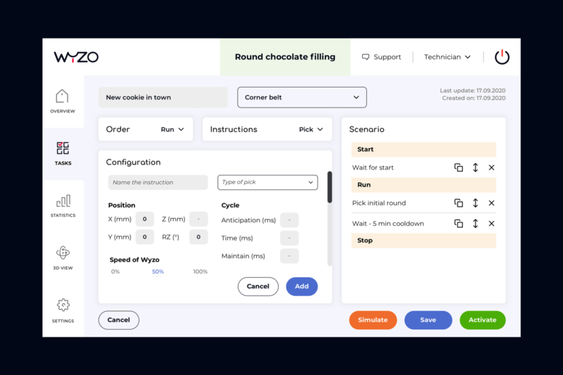
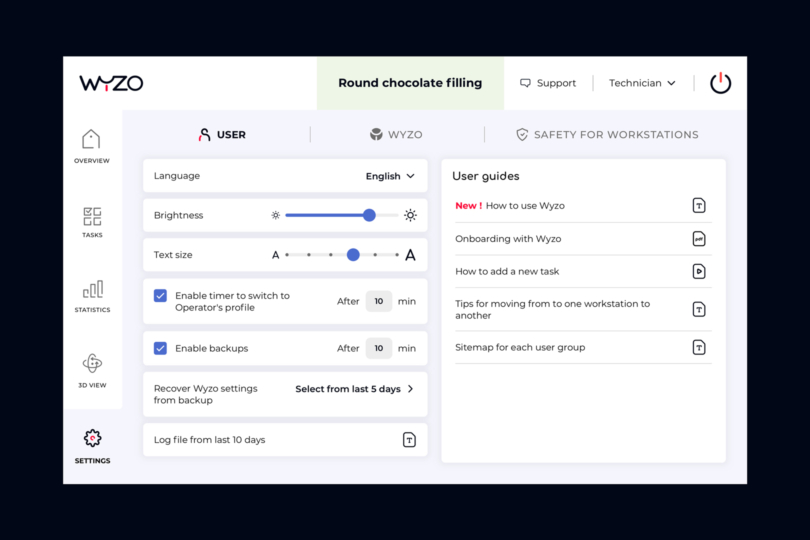
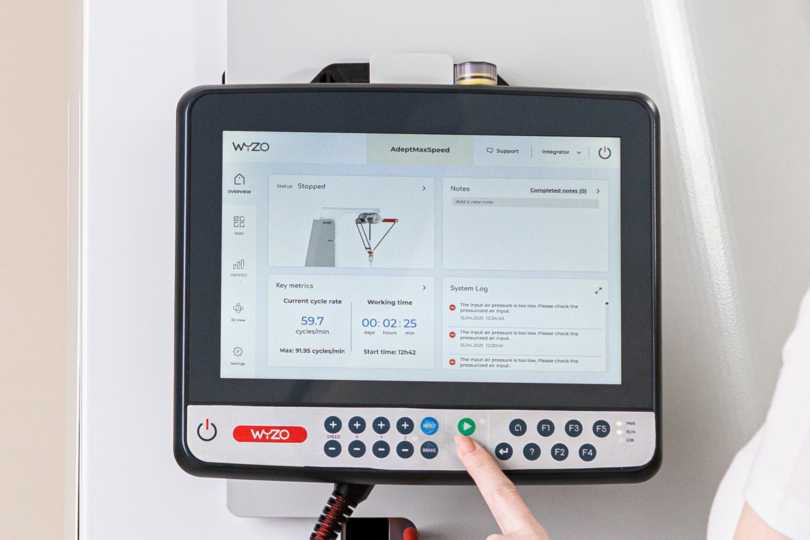
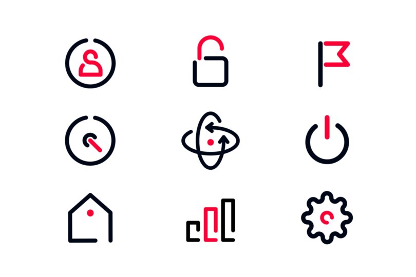
One of Wyzo’s unique features is the application used to control the machine. The app is installed on a detachable tablet. It allows operators to program the bot when at rest, but also manage settings and view information in real time. A substantial amount of work was done on both UI and UX. In terms of UX, the priority was set on architectural clarity, so users can quickly find the functions they need, especially when the machine is in use. As for UI, every effort was made to improve on-screen readability: a no-frills interface, clear icons depicting the various functions, and menus optimized for use on a tablet.
The highly technical Wyzo project was completed in under 6 months in order to coincide with the launch of the product.
