With over 10,000 members, SKO (Schweizer Kader Organisation) is the largest and most diverse professional association supporting the careers of leaders from all sectors in Switzerland, since 1893. After identifying the need to modernise its brand to better appeal to and engage with new and younger members, SKO contacted Creative Supply to help them create a next-generation leader brand.


Professional leaders face a wide variety of challenges today: from globalisation and digital transformations to complex new work and office environments. Making the right decisions in this world of uncertainty and constant change, while leading one’s team to success, is anything but easy. By providing them with training, mentoring, as well as insights into current topics and networking opportunities, SKO accompanies decision-makers at every step in their professional careers to achieve their goals.
The term “kader”(cadre), however, has become too old-fashioned, only used in a sport or military context, and has misleading meanings in French and Italian. Likewise, the original positioning of SKO as a “competence centre for executives” lacked both relevance and appeal. A new positioning and a new visual identity were needed to make the organisation more attractive to existing and prospective members alike.
The future of Switzerland at heart
A very welcome challenge was that the project had to be run bilingually (in German and French) in order to include as many association members from different language regions as possible to ensure cohesion and dynamism. The first step involved changing the name. Instead of the outdated Schweizer Kader Organisation, a name was chosen that was easily understood and embodied exactly what the organisation stood for: Swiss Leaders.
It quickly became clear in the process that the concepts of openness, sustainability, diversity, agility and responsibility had to play a central role in the new positioning. We thus framed Swiss Leaders as a community for purposeful professional and personal development, promoting sustainability and diversity in Switzerland. This positioning was supported by a set of key messages and editorial themes developed to articulate a coherent communication strategy, and include topics such as leadership challenges and trends, or how leaders can contribute towards more sustainable office practices in Switzerland.
Swiss brand, Swiss design
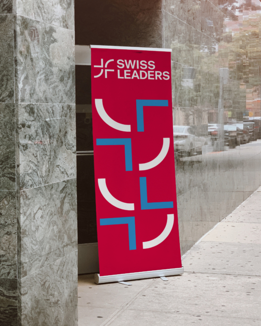
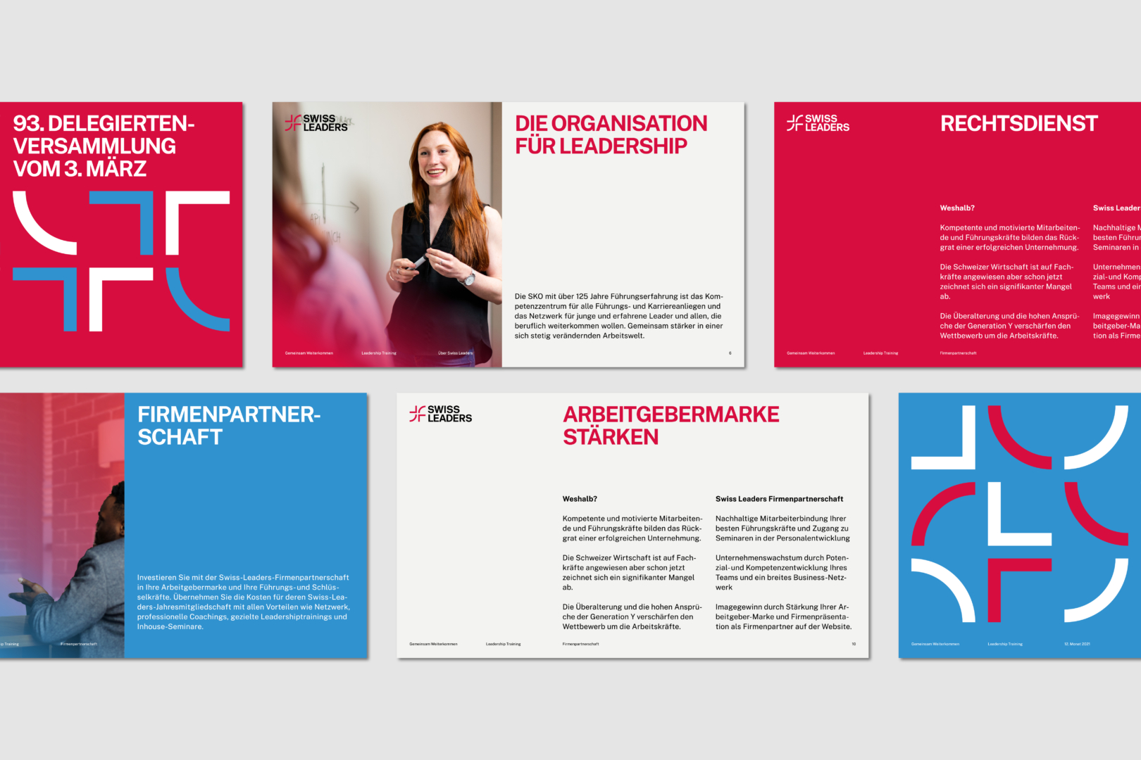
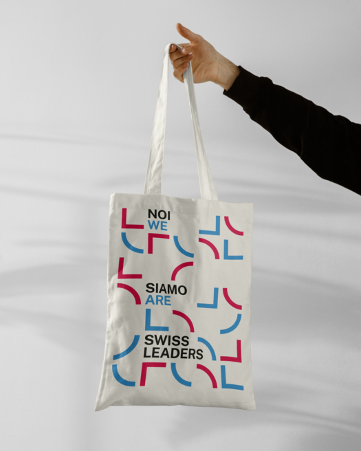
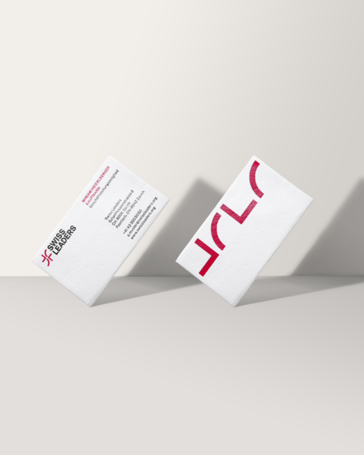
The brand design created by Stefan Hürlemann and Arjun Gilgen reflects this positioning. The logo and the design system are based on the core value of responsibility, illustrated by a circle representing humanity and the Swiss cross representing quality. Variations on these elements allow Swiss Leaders to illustrate the additional brand values of openness, agility and diversity, leading to the figurative mark. As for the logo, the figurative mark is complemented by Swiss Leaders, written in a typical Swiss grotesque font. The basic elements of the figurative mark also serve as the basis for all pictograms and a brand-defining pattern. Regarding colour, the interplay of red and blue give the visual identity a strong visual impact. The Value Red stands for “Swissness”, passion and motivation. The Innovation Blue contrasts the red and stands for innovation, sustainability and professionalism.
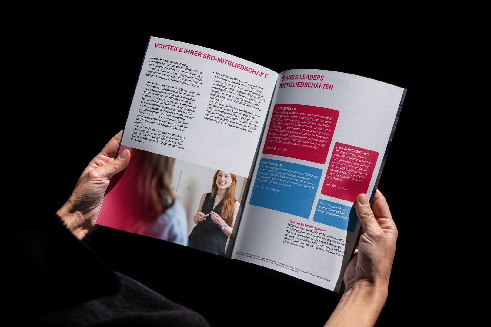
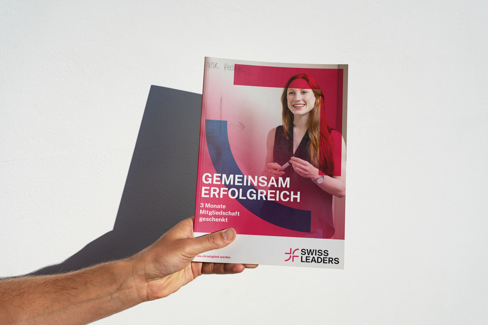
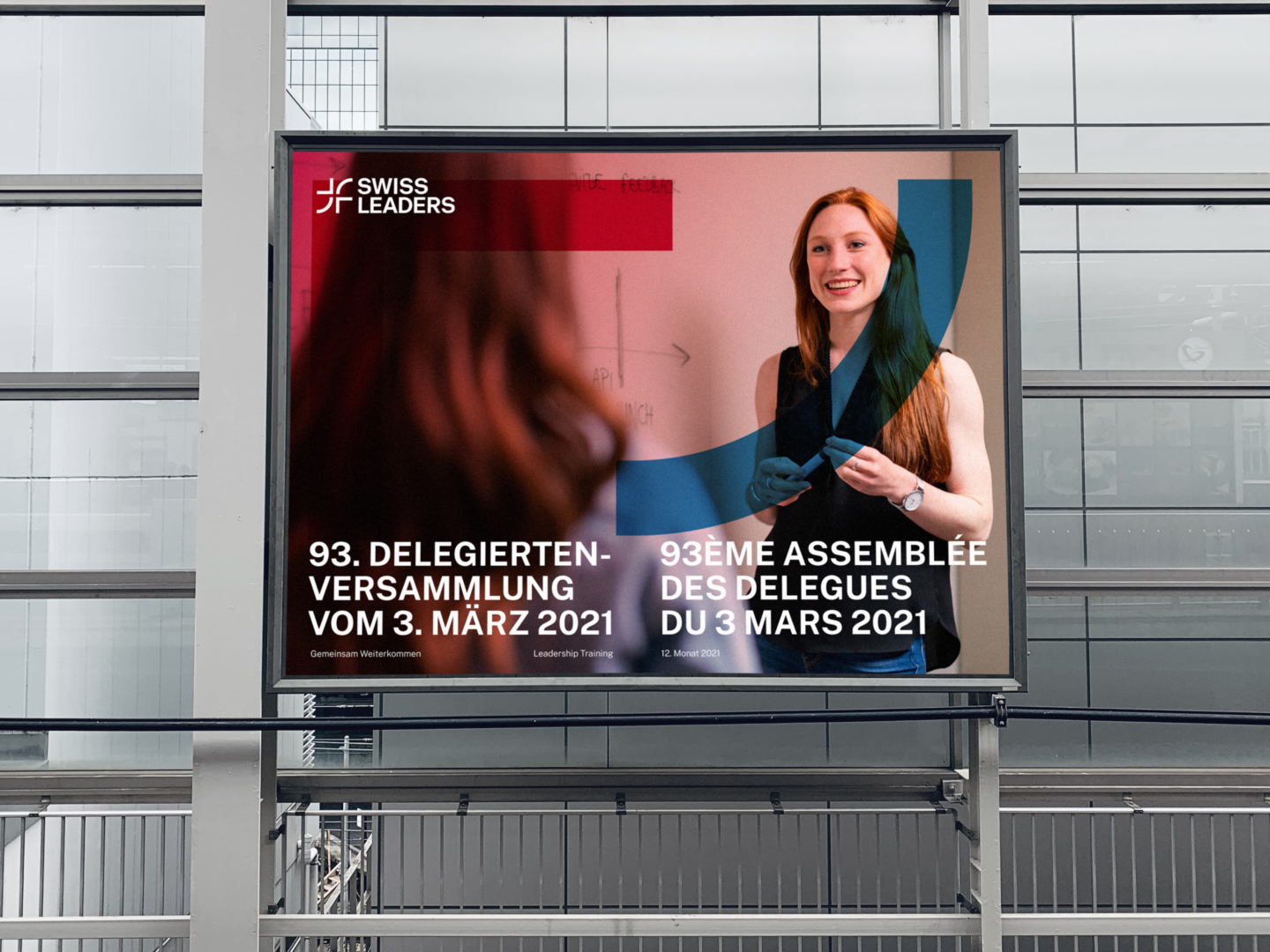
The proposed photographic direction conveys a diverse, modern image. While classic leadership roles are still represented, they are complemented by visuals of newer, more unconventional leadership styles. The images are rounded off with gradients in the brand colours and incorporate the graphic shapes that characterise the brand.
The new visual identity served as the basis for multiple applications, ranging from flyer designs to social media and PowerPoint templates to rollups, business cards and tote bags.
The new brand design of Swiss Leaders will be unveiled in autumn 2021.
