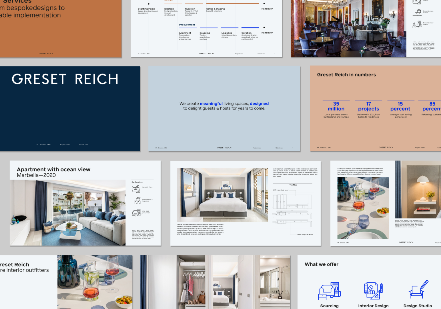
Functionality and great design. An intricate balance that defines Greset Reich’s expertise in creating perfectly fitting interiors. We worked alongside the Greset Reich team to build a brand as elegant and timeless as the spaces they create.
Based in Zurich, Greset Reich is a sourcing and design service provider. Following a unique and collaborative approach, this husband-and-wife team creates bespoke and unique interiors for private residences, hotels and commercial spaces.
Greset Reich called upon Creative Supply to develop an all-new brand, from defining their brand strategy to creating a strong and boundless visual identity.
When Greset met Reich
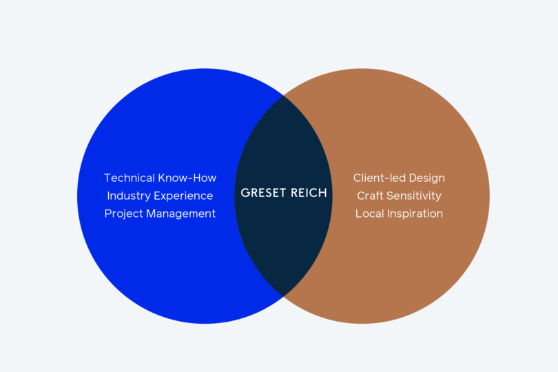
To kick-start the project, we held a strategy workshop with the Greset Reich team to understand and define the ambition and vision of their business. Previously framed as a hospitality consulting firm, the idea was to present Greset Reich with a new positioning that extends to the multitude of services and clients they provide.
From furnishing a museum hall, designing a private residence to creating innovative tableware, we defined their offerings’ limitless possibilities into the simple idea of: “creating meaningful living spaces, designed to delight guests and hosts for years to come.”
Form and function follow meaning
How to build a solid yet impartial visual identity?
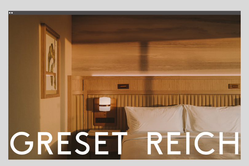
When designing a brand for interior designers, the main challenge was to build strong and universal visual language. Drawing inspiration from the brand promise of offering meaningful, elegant and timeless interiors, our art director, Hyo Jung Lee, designed an identity that aligns perfectly with the project.

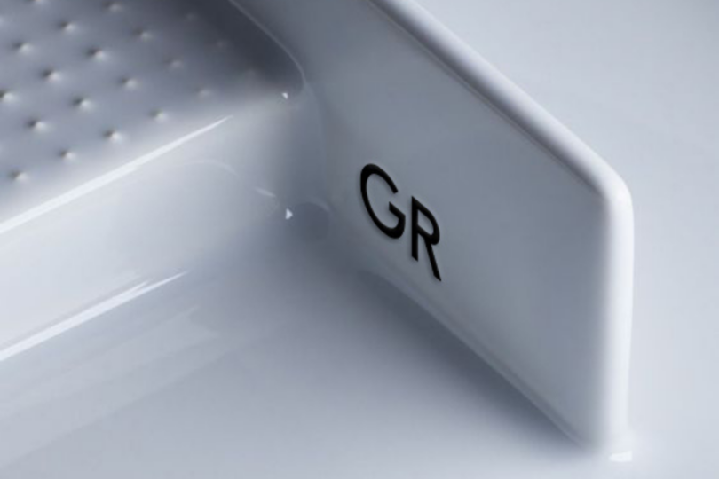
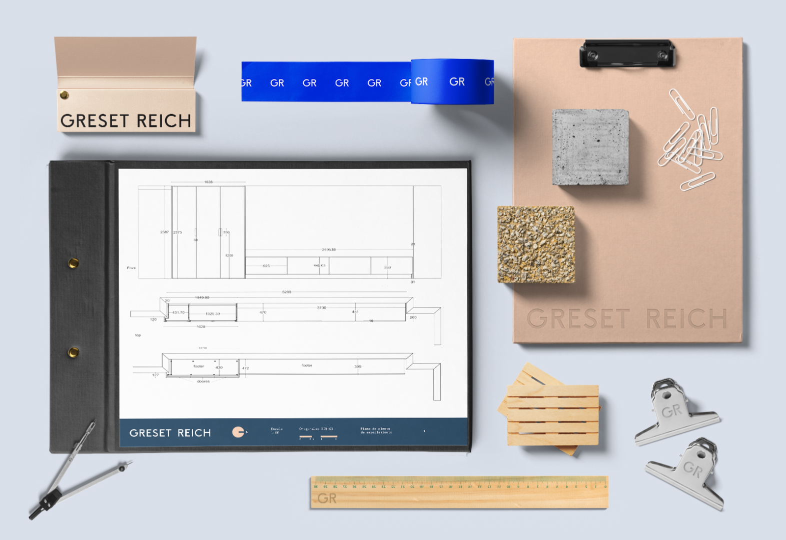
The logotype uses a robust yet simple font that conveys rigour and warmth. Additionally, we created a GR avatar to be added on B2B products when the logotype should not be visible.
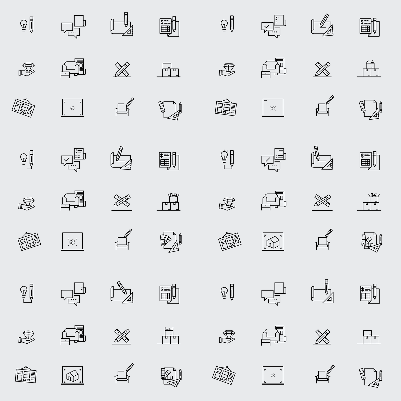
To accompany the variety of services offered throughout their customer-centric process, we took a minimal approach in designing a complete catalogue of friendly, humanistic, and quirky pictograms.
Translated in Terracotta
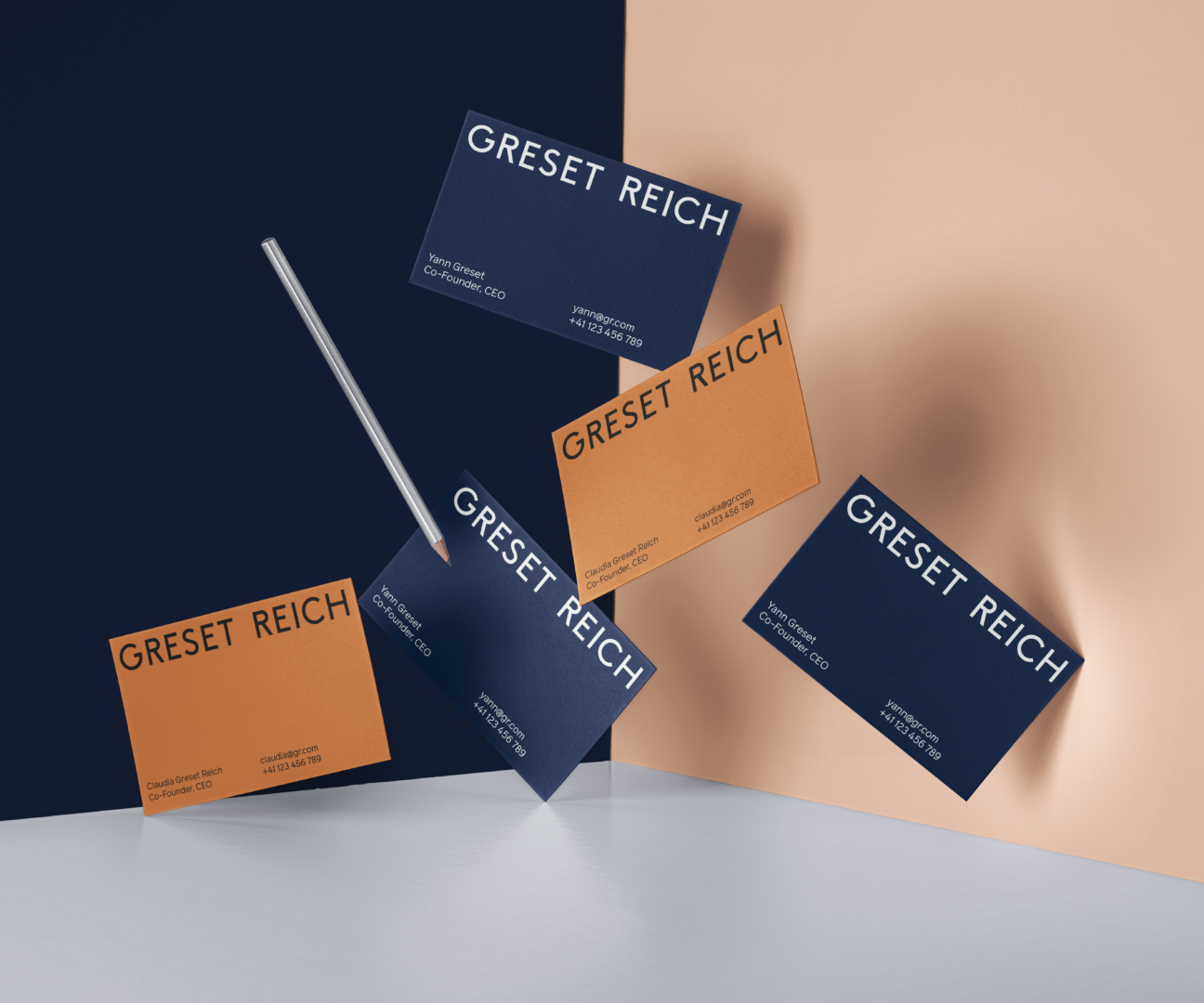
A full cast of colours was created, balancing between the technical and corporate (rich navy blue) with a warm, human-centric design approach (Terracota brown). While the colour scheme is deliberately muted, the choice of the Bleu Majorelle as a secondary colour brings an aesthetical voice of detailing and elegance.
Other project milestones included the content development and design of the company brochure, as well as the product and space photography guidelines.
Greset Reich all-new brand was very well received by the stakeholders of the project. It now guides the next steps in web design and photoshoots.
