Driving customer acquisition with smart brand positioning, a compelling product strategy and a seamless digital experience
Born in 2018, FlexOffice is a fast-growing company that offers thoughtfully selected and designed office spaces across Switzerland.
FlexOffice has it all: prime locations, a strong team, and well-thought-out products and services. Yet, potential customers failed to see the true value of the FlexOffice offering.
That’s when Creative Supply stepped in. We partnered with FlexOffice to take their brand to the next level by leveraging brand storytelling, streamlining product communication and building a strong digital presence from the ground up.
From office rental to workspace membership
The company first needed to identify and express its value and mission clearly in order to show its audience how competitive its offering is compared to the market. In other words, we had to clarify brand positioning to better articulate the competitive edge and to find the right angle for the brand story.
Initially, FlexOffice was positioned as an “office rental provider”.
However, this positioning did not reflect the company’s true value for several reasons:
- There was a lack of differentiation compared to competitors
- There was a gap between the perceived value of the product (too expensive) and the actual value that customers receive (saving hassle and money in the long run)
- It was missing aspirational aspects to boost FlexOffice’s brand growth–and business–growth
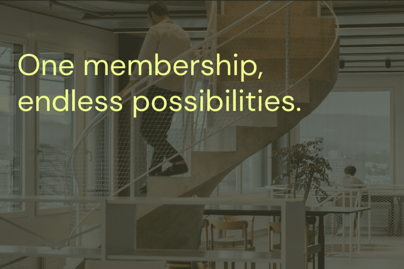
Following our analysis of the brand’s status quo, we first worked on shifting FlexOffice’s brand positioning from product-centric to customer-centric. We introduced the term “workspace membership” to highlight both the unique business model and the value proposition of FlexOffice. This subtle shift sparked an aha moment within the FlexOffice team.
The team started picturing all the possibilities of how this shift could alleviate concerns about product pricing and open the doors to stronger customer engagement and acquisition. It also created the basis for renaming their product offering and community.
| From product-centric to customer-centric branding |
| Before (product-centric) | After (customer-centric) | |
| Frame | Office rental | Workspace membership |
| Positioning | “The modern office solution for agile companies” | “The workspace membership for teams of all sizes and stages” |
| Story | We provide serviced office spaces. | We bring together interaction, inspiration and people through all-inclusive workspace memberships. |
| Signals | Product naming based on office types Focus on selling product features Visuals focused on office spaces Calling those in the community “tenants” Single-colour brand identity giving a corporate feel | Product naming based on membership plans: Flex Solo, Flex Team, Flex Corporate Focus on selling product benefits Visuals showcasing people and community Calling those in the community “members” to set the right expectations for the product and recall the benefits of membership Multi-colour brand identity to signal inclusivity and warmth |
| Website Experience | “Brochure-like” website that lists the company offering in a mechanical and feature-based way | A seamless customer experience that enables visitors to: Discover the story of the brand Learn about the products Evaluate product benefits thanks to aspirational and targeted copywriting Get excited to book a tour |
Elevating the brand’s design aesthetic
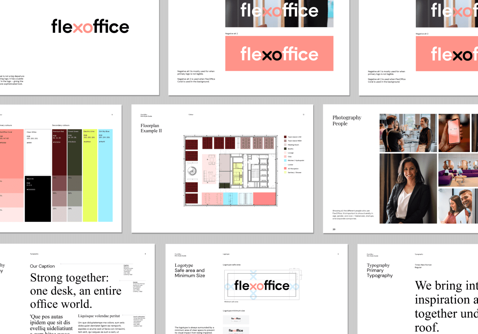
Repositioning FlexOffice’s offering as a people-centric membership model called for an elevation of their brand identity.
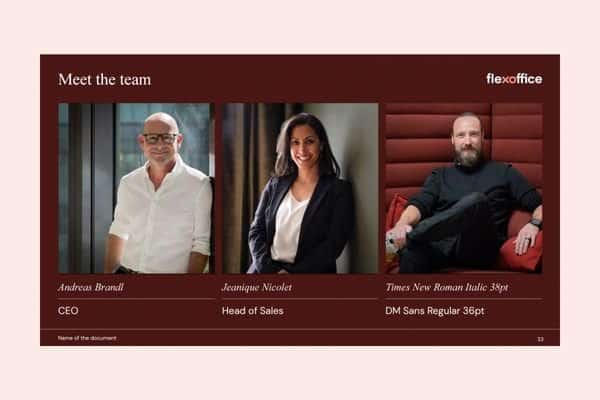
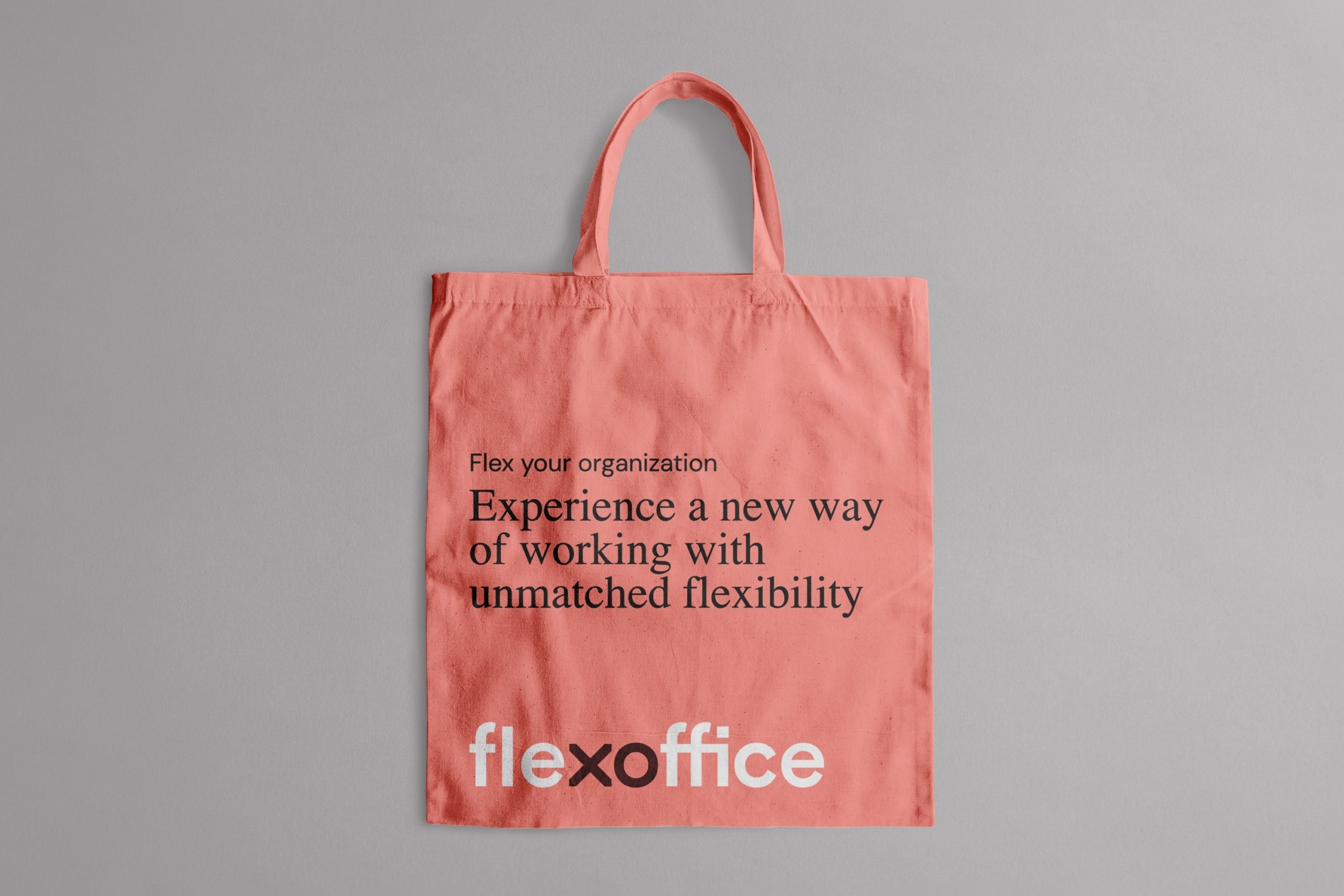
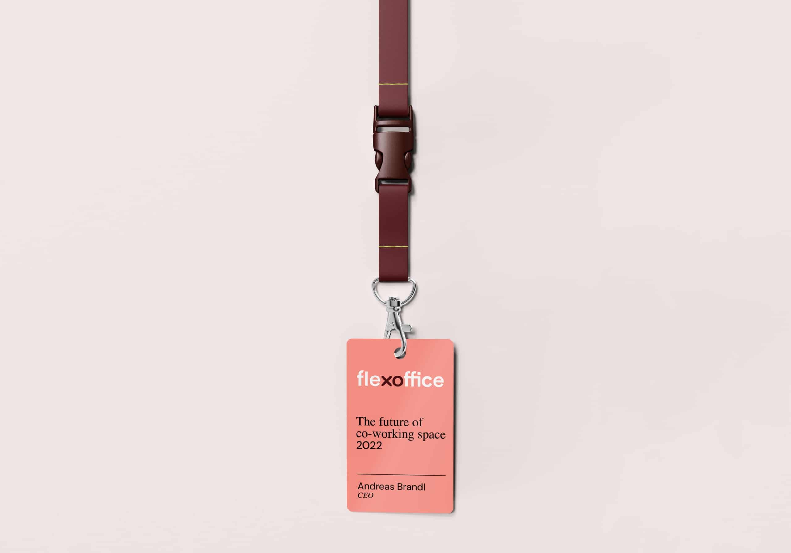
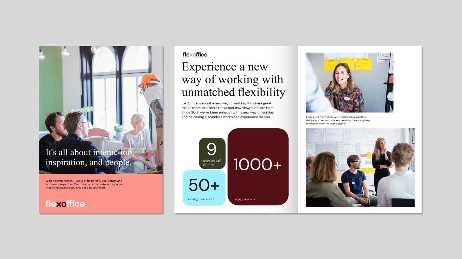
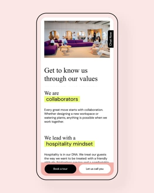
We kept FlexOffice’s iconic coral, softening it and complementing it with a full-colour palette to bring warmth and inclusivity to the brand and to reflect the diversity of their community members.
We introduced a mix of serif and sans-serif fonts to give a touch of sophistication.
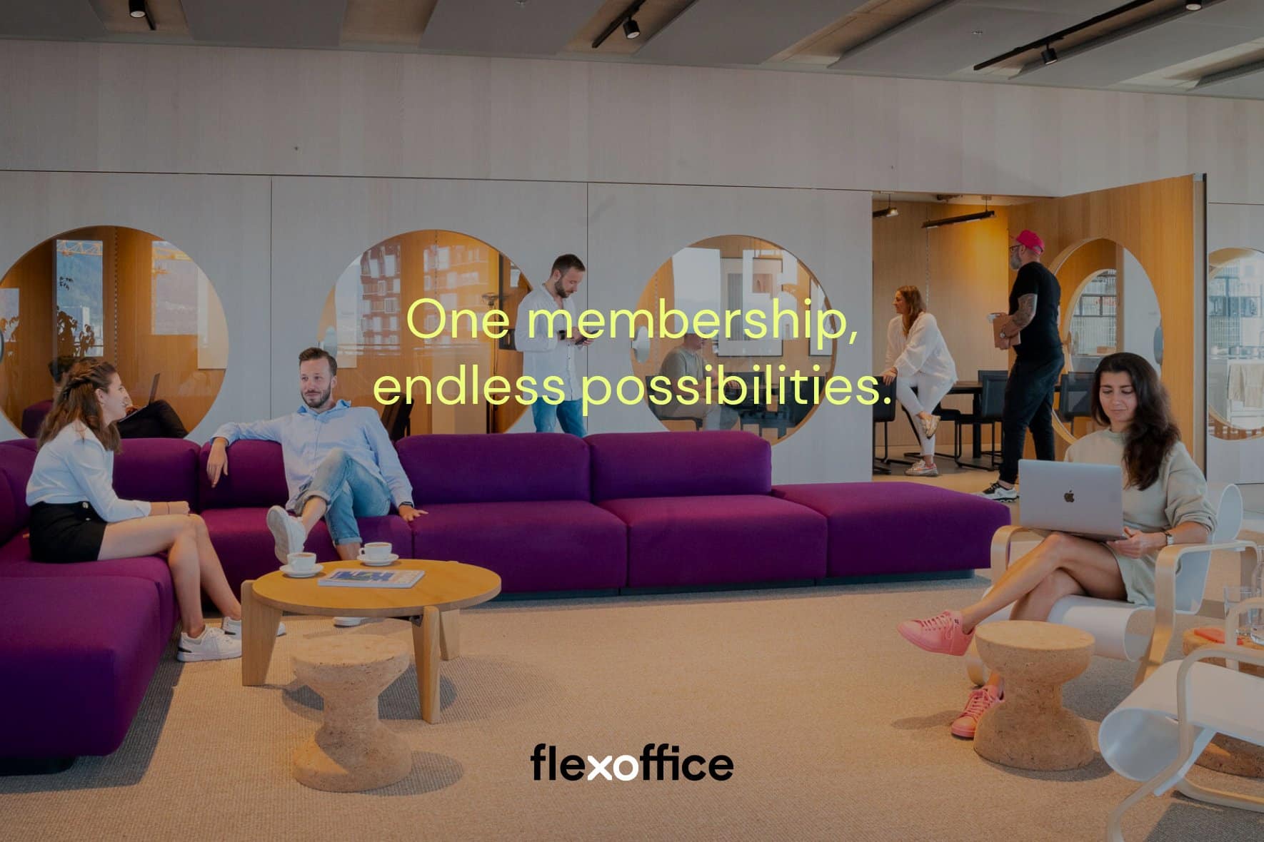
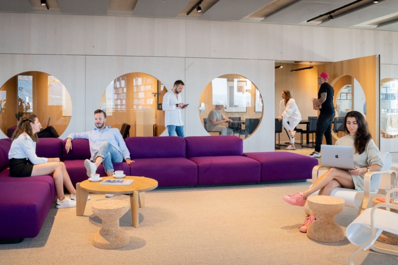
The photography brief emphasised using natural light and featuring people at work to depict the product experience in an exciting way and to appeal to the target audience.
Bridging the brand with digital experience
Creating an awesome brand with an awesome product is one part of the story. The other part is bringing it to a defined target audience in a competitive way. At Creative Supply, we value establishing a base for sustainable growth firstly through owned channels. That’s why we designed the FlexOffice website from the ground up to turn it into a powerful digital headquarter that amplifies the story of the brand and effectively converts website traffic into leads and sales.
Guiding website visitors throughout their customer acquisition journey in a seamless way
When designing the FlexOffice website, the challenge was to address all the needs of “window shoppers” and “hesitant buyers”. We wanted them to be able to find the answers they were looking for about the brand and all membership plans and also to have a pleasant brand experience using the website.
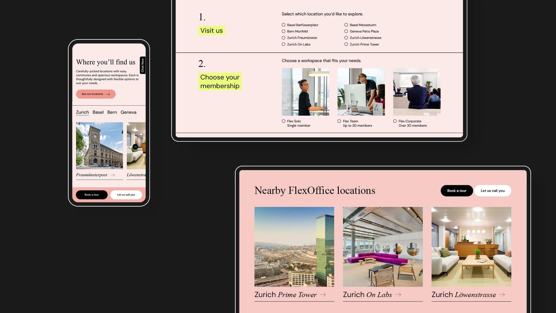
Firstly, we ran a UX workshop involving the core management, marketing team and sales teams. Based on our findings, we mapped out all required website features and developed a medium-fidelity prototype presenting a preliminary UX concept for the website.
| Designing the website by integrating the customer acquisition journey |
| All-in-one home page | One stop to catch all visitors by answering the 4 key questions of any visitor: 1. What does the brand stand for? 2. What are its products? 3. Who else has trusted the brand? 4. How can I get the brand’s product? |
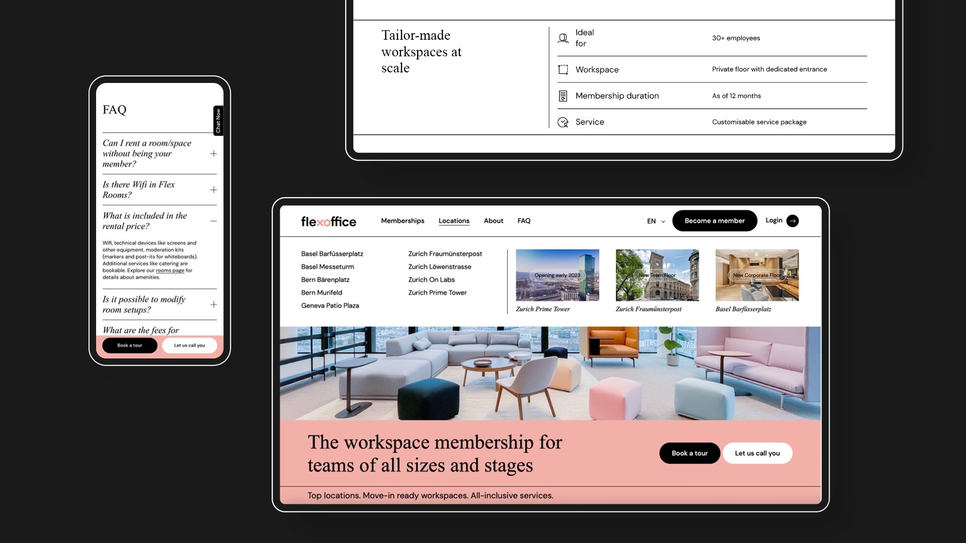
| Appealing product pages | Showcase each product offering (aka membership plan) in a customer-centric way with: Easy-to-scan product introduction texts using tables Bullet points highlighting the product benefits Aspirational, strong visuals picturing the product experience Different colour-coded sections |
| Smart copywriting | Short, catchy and SEO-friendly copywriting to help website visitors form clear opinions about the brand, understand how the product works and confidently take action on the website |
| Experience-focused visuals | Human-focused visuals to build credibility, such as: Introducing the team on site (called Location Managers) Natural pictures of people enjoying the brand experience Landscape and detail shots to present the premium infrastructure, including the welcome desk, community kitchen and meeting rooms |
| Engaging call-to-action (CTA) options throughout | Facilitate action through multiple call-to-actions, such as “Book a tour”, “Let us call you”, “Become a member” Capture website visitors quickly through a side panel Use relevant CTAs throughout each page Speed up the lead generation process via a FAQ that addresses real questions that the sales team regularly addresses Use the footer for more than just a navigation corner with an eye-catching CTA |
Generate more leads through the website
While designing user interfaces, our focus is always to be to the point, intuitively simple and genuinely digestible. So we showcased the membership plans and locations already on the homepage to start serving the customer needs immediately. As the navigation menu is one of the most viewed and most clicked-on user interface components, we made it simple with a flat hierarchy.
We opted for a mega menu allowing users to visually explore locations and information about membership plans. We also kept the main CTA of the website, “Book a tour” easily accessible at all times with a side panel.
Furthermore, we dedicated a full page to the FAQ to establish trust with potential customers, overcome their concerns and encourage them to take action.
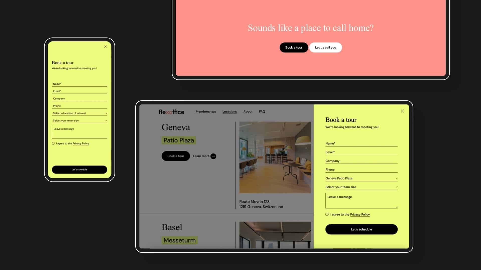
After creating the functionalities and information architecture, we incorporated the brand aesthetic as a part of the Visual Interface Design step, where copywriting and visual design work hand-in-hand.
We structured the brand narrative and formulated all the website content. Straightforward and witty headlines are supported by SEO-friendly, descriptive texts and boosted by human-focused visuals. Individual membership pages are designed to have all the information a customer could want in smart layouts — membership specifications, all amenities, experience-oriented images, testimonials, and FAQ.
We finally handled the translation of all the text content into English, German, and French to ensure the digital experience stays on brand from Geneva to Zürich.
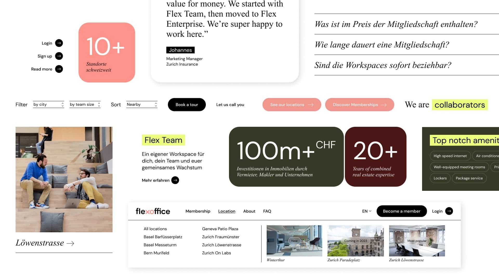
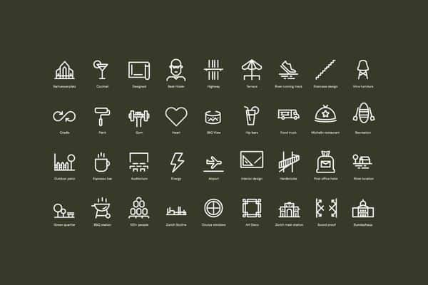
We took into account the future business requirements by using flexible and reusable modules on the website so that the FlexOffice team could grow their website with the growing number of locations, event rooms and membership plans without any hassle. We documented all design guidelines in a style guide, a clear and concise reference file featuring all details about style (logo, colours, fonts..), layout principles and user interface components (menu, buttons, forms, icons..).
An effective digital experience strategy proven in numbers
The smartest way to stand out from the competition and engage with customers is through an impactful digital experience strategy. That’s what we achieved with FlexOffice. Following all the changes in the brand story, product communication and website design, FlexOffice has seen a significant increase in their customer leads from the web. On a happy note, FlexOffice continues to partner with Creative Supply in creating brand communication and marketing assets.
“We are working together with Creative Supply on our brand identity and our website. The collaboration is fun, professional and efficient – and we love the results.”
, CEO, FlexOffice
