Rebranding the EMBA of a leading Swiss university.
The MoT program, created in 1998, is the only Executive MBA program offered by the Ecole Polytechnique Fédérale de Lausanne (EPFL) university in Switzerland. Amid a rise in executive education supply, EPFL called us to help strengthen the EMBA’s position in the market and give it a more modern image.



“We chose Creative Supply not only because of their competent presentation and approach, but also because of their range of experience—including in the higher education market.”
, Executive Director
New positioning
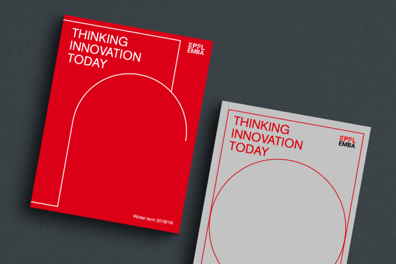
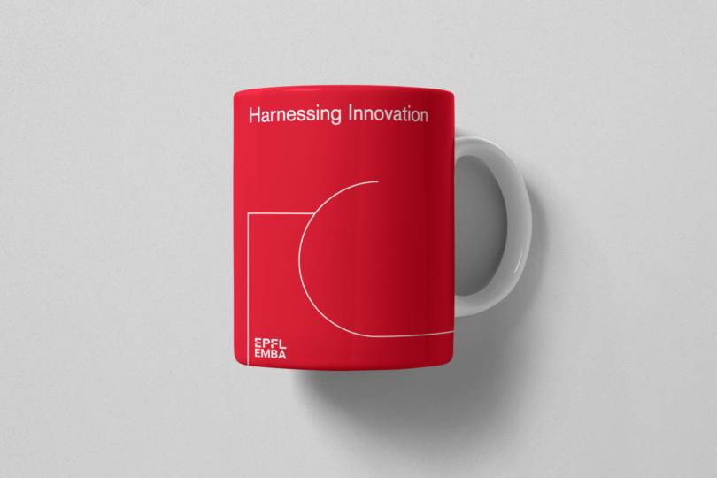
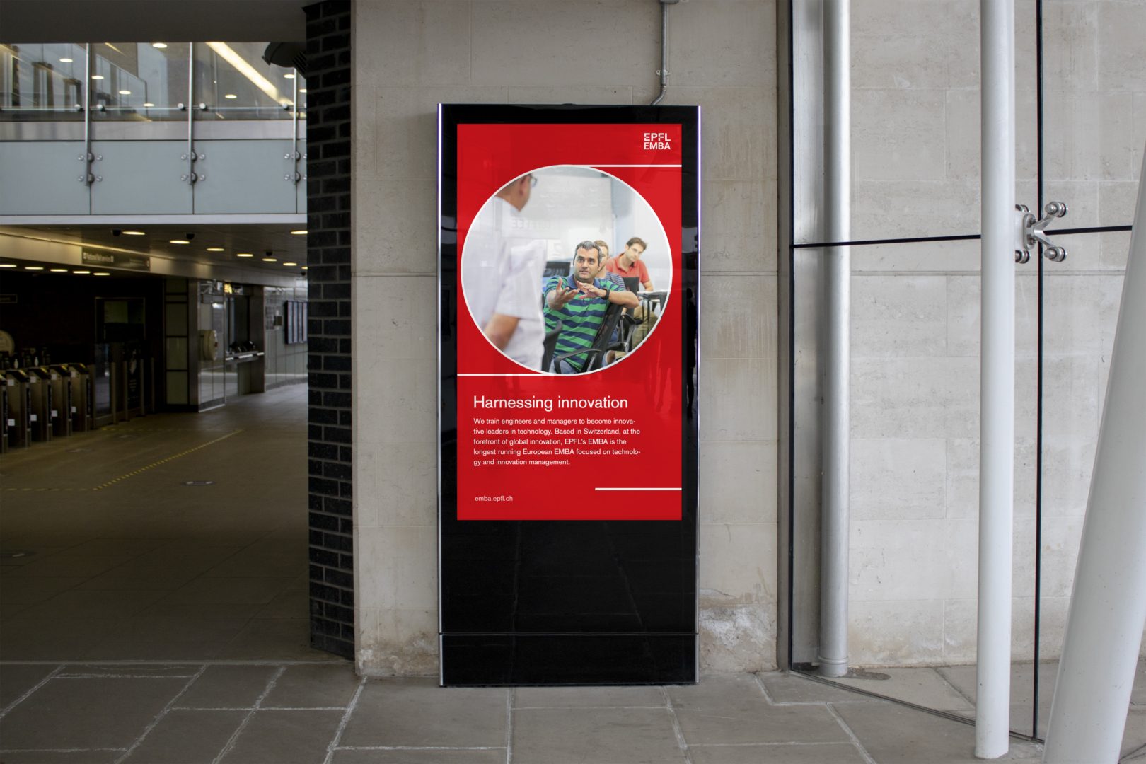
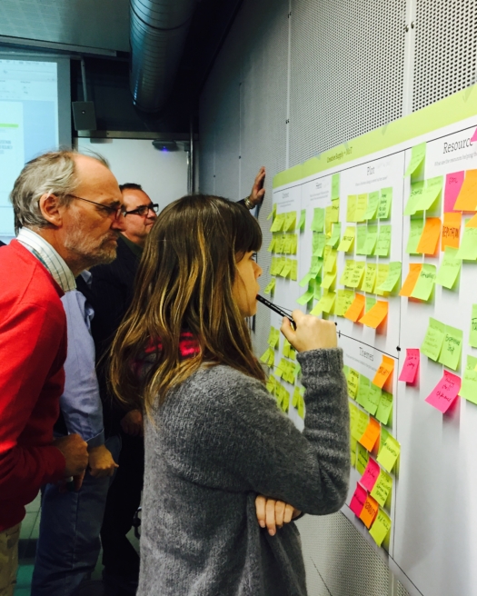
We realised that the program had to go through a complete creative transformation in order to meet the university’s goals. The previous positioning of the MoT was confusing. “Entrepreneurship,” “business,” “technology” and “innovation” were used interchangeably to describe the program. Based on two brand workshops with EMBA management, we decided to make the program’s position clearer, bringing the concept of innovation to the forefront. The tagline “harnessing innovation” brings this new position to life in a simple yet powerful manner.
New name
The name of the program –MoT– presented three main challenges. The meaning of the 3-letter acronym (Management of Technology) was recognisable only to candidates with an engineering background. Then, the low visibility of the EMBA certification was limiting the program’s reach. Thirdly, the name wasn’t relevant to the new positioning of the program.
The program’s advisory board backed our recommendation to drop the MoT acronym. The straightforward name “EPFL EMBA” was selected as the new title to highlight the key value proposition of the program – an EMBA degree from a renowned school.
New visual identity
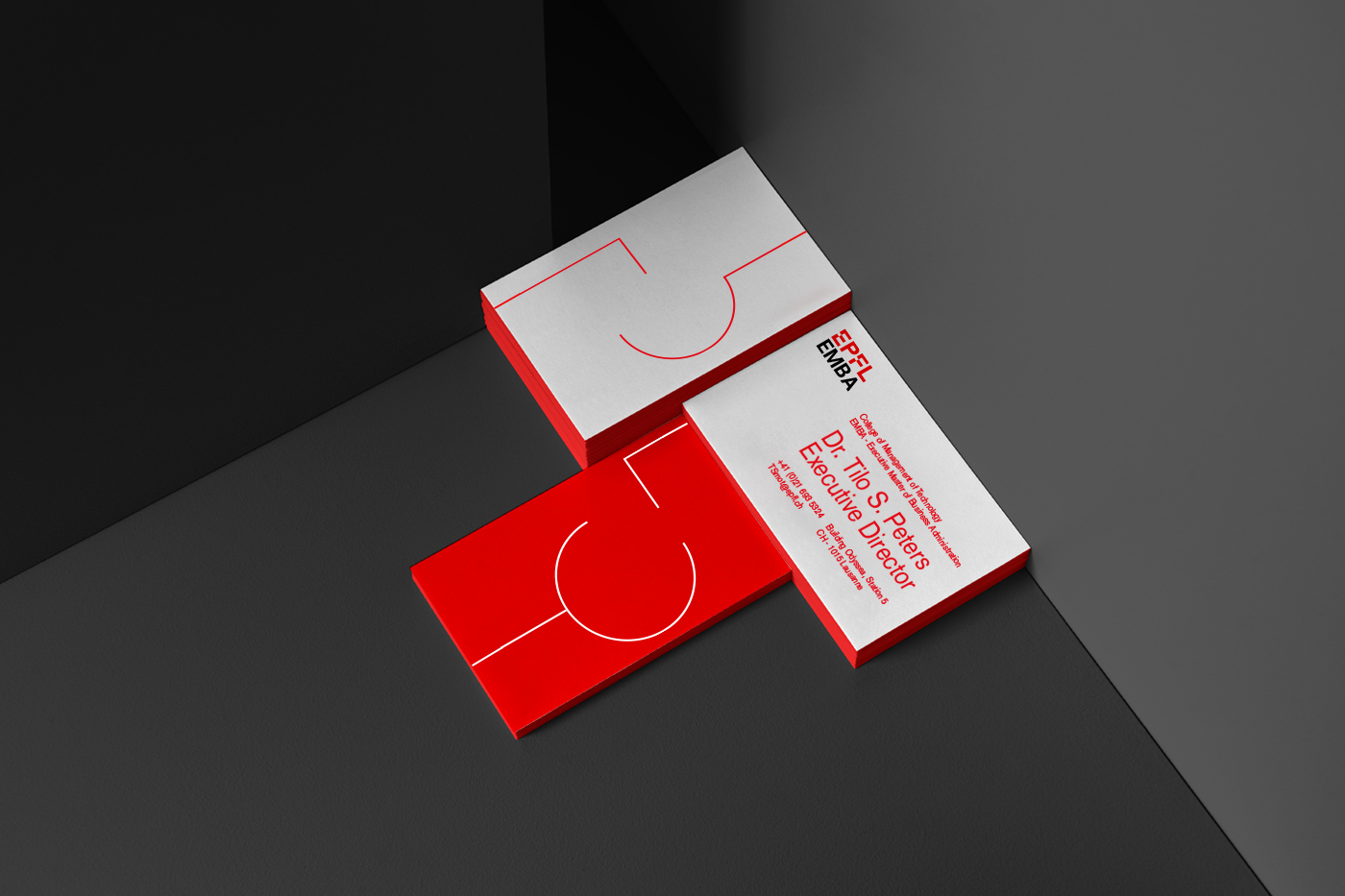
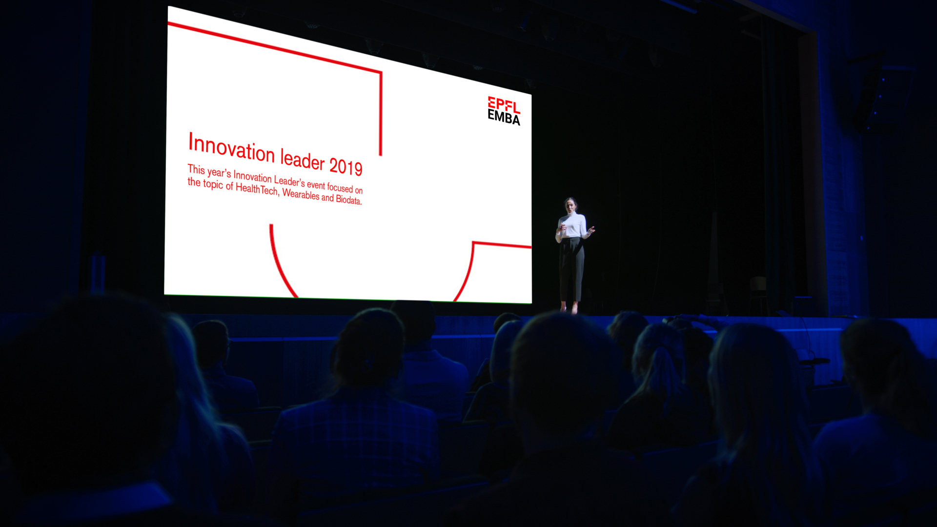
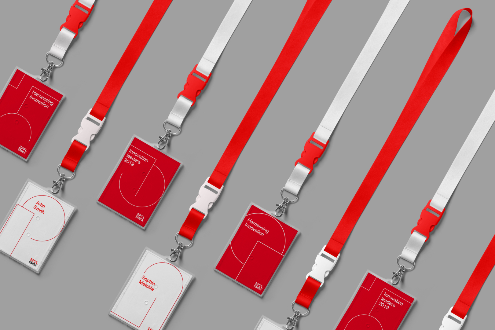
More than a logo, the EPFL EMBA needed a dynamic visual system that would be recognisable everywhere, from business cards to social media, on which we worked with Maximilian Heitsch and Korbinian Lenzer from Moby Digg, a Munich based design bureau.
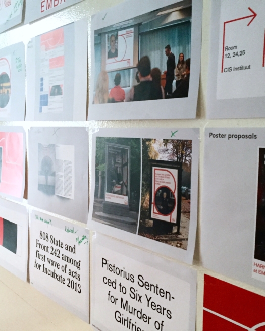
We symbolised the merging of business and innovation by overlapping angular lines representing business with curvy lines representing innovation. The lines theme is present throughout the program’s new imagery. For instance, we superimposed red lines over student portraits to visually represent the dynamism of the program. The EPFL red was the only primary colour utilised to establish an immediate link between the EMBA and its Alma Mater. For the launch, we developed the design for several collaterals including a mobile charger, a roll-up stand for trade shows, brochures and lapel pins.


“The process was inclusive and supportive, we had confidence in the decisions we were making and that they were backed up by solid evidence. I strongly recommend Creative Supply!”
, Executive Director
Impact
The new positioning and brand image was well received by the program participants, alumni and faculty members. Following this successful relaunch, Creative Supply has been mandated to boost the EPFL EMBA brand awareness digitally.


