Simplicity
2017 is not the time to put a limit on creativity. However, for people who are used to fast paced environment which requires immediate actions, longer loading times of three dimensional elements cause a problem.
Simplifying is a reaction against complex three dimensionalism. Flat design has been growing more popular since Microsoft’s Windows Media Center and later – Microsoft’s Metro, while Apple caught up with this trend only recently with the release of iOS 7.
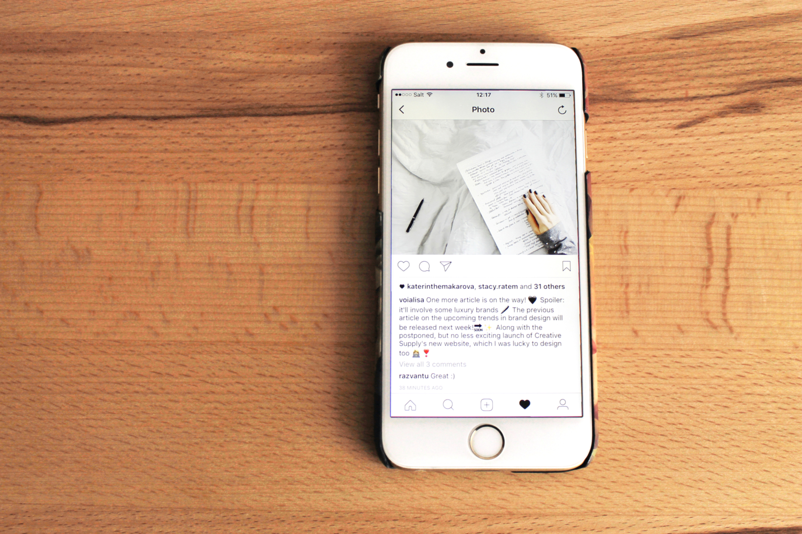
Today, a number of big brands has already “flattened” to their company’s digital products. Netflix turned from a flat logo to an even simpler design, Behance has adopted material design elements in order to improve functionality of the popular website, Instagram flattened the “digital only” company’s logo and app design in order to achieve a consistent look with iPhone’s iOS 9, which came out in 2016, and the list goes on and on.
However, not all elements will stay flat this year. More brands will focus on the same modern, sleek, simplified design; however, they will be adding elements of skeuomorphism, just like the Apple’s recently released feature of iOS 10.2 including over a hundred new Emoji with a more realistic, three dimensional look. The implementations of material design, known as “almost flat” or “Flat 2.0”, will expand across larger number of websites and mobile phone applications.
Flexibility
We are in the year 2017, therefore you must be reading this article from an iPad, a Galaxy or an iPhone, or perhaps a 15 inch desktop. In order to respond to various screen sizes, all elements of design have to be flexible too, and we are not talking only about the modules of your website that move and transform when you turn your iPad horizontally. The brand’s digital elements have to be flexible across a range of purposes. Think of the ones you tend to overlook: social media icons of all shapes and sizes, placements of your brand’s logo on the videos, and so on.
One of the solutions we created is a logo for EPFL EMBA, which has dynamic graphic elements that are designer to be easily transformed to match the needs of design at hand.
If one flexible logo is not enough, why not makeover seventy logos? This outstanding example was demonstrated by White Studio. A branding of Porto, a city in Portugal, “needed to be much more than a single icon, much more than a single logo”. An overwhelmingly large amount of icons created for this purpose represented the city and its people, and the single style of the icons brought all these elements together in one coherent identity.
With the growing need in reusable modules packed with functionalities, which can be transformed and shifted into different scales and screen sizes, modular design still propose the best solution to the problem. The devil is in the details: pay attention to all graphic elements of your brand and make sure they are just as flexible as modules.
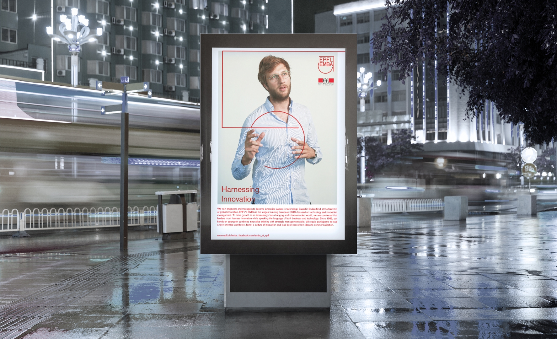
The lines of the EPFL logo can be used in a variety of shapes and sizes.
Reality
Initially, authenticity was a response to globalization and economical crisis, which raised the client interest towards the home made, traditional and familiar. However, authenticity branding has become overused, with every cafe on your street being decorated with an Edison bulb and a brick wall. The consumers are in the search of brands that are respectful of clients, with an honourable mission and strong leadership skills. This “real” approach has been triggered by the social media celebrities, the rise of popularity of individuals, real people; it was picked up by the brands that realized that user generated content has reach.
In 2016, the overreaction of the brands to authenticity resulted in customers losing interest and trust in it. Such popular social media accounts as Socality Barbie have made fun of the term through staged pictures of a hipster culture inspired Barbie doll, including sarcastic captions to Instagram pictures in order to point out the “fakeness” of authenticity. However, the engagement with the customer is what the quality of realness relies on, and what better way is there to create engaging content than to involve a customer in a content creation process.
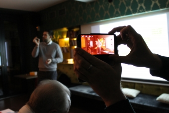
In the upcoming year, the brands have to make it’s own course, reflecting your unique ideals and values. To achieve “realness”, start with staying away from everything spurious and replacing stock images with hand-drawn illustrations and real photographs. Capturing behind the scenes pictures with a phone camera will only increase the perception of authenticity. An additional solution is not to only focus on the commercial imperative, fine tune the quality of the content in the brand’s digital products.

To be continued…
Branding Trends Of 2017: Part 2 is coming soon! Follow Creative Supply on LinkedIn and Facebook to stay updated on the latest articles, news and events.
Would you like to share your thoughts with us? Send an email to Youri at youri@creativesupply.com.